This post describes how to take raw elevation data to make the lion's share of your basemap.
Here are some highlights:
- The data is free and out there.
- Hillshade makes stuff look real, man.
- Shadows tend to be blue.
- You don't have to stick with literal elevation color schemes.
The Source Data
I downloaded a set of global Digital Elevation Model files from NOAA. DEM files are black and white images whose brightness corresponds to elevation.
You can get them here:
Set Up a Cool Elevation Map
Here's what the imagery looks like. Darker pixels correspond to lower surface elevation, and whiter pixels represent higher elevation...
A raw DEM image from NOAA is a black and white image, corresponding to actual elevation.
I fit a brightness mapping to the elevation data so that there is nice visual variability within the image (mountain tops are bright white, sea-level is black, and between values have visual interest). I stretched the values along it's histogram for max good-lookiness...
Stretching the pixel values along some static rule reveals detail and makes stitched-together DEMS more seamless (or less seamfull?).
Because the dataset I downloaded came in 16 separate images, I had to fit a uniform assignment of pixel values to brightness, so that you couldn't see the seems between the individual images, like you can in this example...
Making the elevation-to-color profile consistent across my set of DEM images to avoid nasty seams where images line-up.
Swapping out the grayscale for a landscape-ish color gradient is a cheap carto-hack. And I like it.
Greenland and Antarctica aren't so convincing, though.
Greenland and Antarctica aren't so convincing, though.
Create Hillshade. Shadows Make It Pop!
Elevation cheats are pretty convenient, but the cool stuff starts happening when you use the DEM images as inputs to a hillshade-making engine. The hillshade effect is a really convincing way of illustrating depth! I used Spatial Analyst to make my hillshade images, but no matter the tool, there are a few options when setting up your hillshades, like the angle of your imaginary light source and how high it is in the "sky." By the way, I feel like a dork putting things in parenthesis like that, but there they are.
When making your hillshade overlay image, make your sun rise in the Northwest.
Shadows just look more convincing when they are cast towards the Southeast.
It's ok, but it doesn't look...real. Where are the shadows?
A hillshader will take that elevation data and whip up what it believes would be the reflective characteristics of an undulating surface. Pick a full-reflection to full-shade color gradient. Here's a tip: use a cooler blueish color as your shade. Light in those wavelengths is more easily scattered in our atmosphere (that's why the sky is blue), so areas that are shaded in real life tend to get their light from the ambient diffused blue light bouncing around all over. If you can fake that, you are on your way...
Scattered light tends to be blue. Consider this when you pick a hillshade gradient.
Yikes! But now we are getting somewhere...
By itself, a hillshade layer can look a little like a desiccated zombie rash, all cracky and severe. When setting up your basemap, make the hillshade layer semi-transparent overlay so that you get a sense of brightness and shadow draped over your elevation layer below...
Drape a semi-transparent version of your hillshade over the elevation. Bang, it's topographic!
You could almost touch it! It reminds me of those thermo-plastic releif maps they had at the library when I was a kid. The library in Mt. Pleasant, MI, even had a thermo-pastic globe the size of a car! Ohhhh I loved that thing.
Now that's a reasonably convincing terrain basemap of Southern Alaska. All using one free (well, federal) data source!
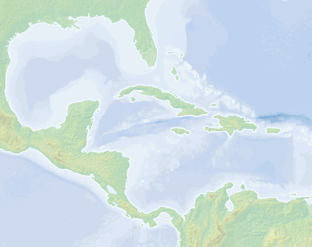
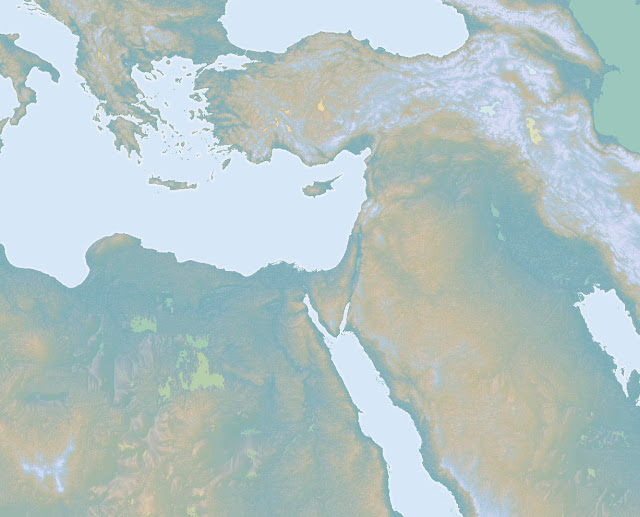
Here are some variations, based on different color schemes used for the same elevation and hillshade combination. The first is a pretty vanilla take on a terrain map, but I really like it. I found a free set of bathymetry shapefiles and colored their depth in increasingly dark shades of blue.
Remember, when you are picking colors for your basemap, cut their vibrancy in half. Then halve it again. Terrain basemap colors are always way closer to white than you'd think.
Here's one with a slightly different elevation color set. Meh.

Here's an example of what I might make for a spy hunter shop. When tracking Jason Bourne, always use a dark monochromatic basemap with glowing boundaries.
In the sequel, your set designer might call for a sepia themed basemap, but that's cool too.
Here is a nice conservative background like you might see under a National Geographic map or in a National Park brochure. I pulled in a lakes shapefile and made it semi-transparent; the translucency turned out pretty cool.
Anyways, you already paid for these DEM images, so you might as well have at them! Happy mapping!
Tweet Follow @JohnNelsonIDV


What software did you use to plot these? And by having seen some topos in my time, it looks like you used also a bathymetric topo for those frames of the Gulf and Kamchatka, which data set are they from?
ReplyDeleteI've been meaning to do a map where I invert the heights of the Earth from sea level and landmasses <-> oceans, but I haven't been able to create a sufficiently detailed map only with monochrome TIFF's with Photoshop.
Do you know what would be a good tool to manipulate height maps?