
Lately I've been working on two unrelated projects that just happened to intersect in a useful way. The first project was playing with spatial binning techniques as one of the ways to map relative proportions of things without being tied to (arbitrary) political boundaries. The second was messing around with Excel pivot tables to find meaningful long term time-of-day trending in traffic fatality data (inspired by Nathan Yau's work here).
While pivoting the traffic fatality data, I thought it might be interesting to map the latitude data to the rows and the longitude data to columns. The result would be a 1980's-Nintendo-looking chunky cell map of the United States (which, if I make the cells square, happens to be a pseudo equirectangular projection). Low and behold...

Here's a one degree by one degree pivot table in Excel that also happens to be a map.

That same data with way more rows and columns.
These maps won't win any awards for style or rigor (raw fatality counts essentially replicate a map of the US highway system), but the result is a pretty handy way of binning up spatial data and generating a workable exploratory map in five minutes or less.
If stooge like me can do it, anybody can (but should they?), and I'm sure I'm not the first to stumble upon this fun bastardization, but nonetheless, here's how you can do it...
If stooge like me can do it, anybody can (but should they?), and I'm sure I'm not the first to stumble upon this fun bastardization, but nonetheless, here's how you can do it...
How-To
Any spreadsheet with a latitude and longitude column can be mapped in this way.
Create a new column of rounded versions of your lat and long fields. The zero value there in the formula determines how many places to the right of the decimal place I wanted to keep. The higher the number the more spatially resolved your map will be. The chunkier map above is rounded to the whole lat and long degree. The second, finer, map rounds to the tenth of a degree.

Now make a pivot table of your spreadsheet. If you assign your rounded latitude values as rows (up/downedness) and rounded longitude values as columns (left/rightiness) then you've got a pseudo-geographic grid. In my example I counted up the number of traffic fatalities and did some conditional formatting to color the cells in. Aside from pushing and pulling the width and height of the columns and rows, that's pretty much it.

Set up your pivot table to hack rows as latitude and columns as longitude.
Heads Up
Because the nature of this method creates cells based on the simple ordering of lat and long values in your spreadsheet, you will only have a map with rows or columns that have data. For example, there is a lot more true space between Hawaii and the mainland but because there are no lat long values for the middle of the ocean, Hawaii is snugged right up to the rest of the country. So if you have sparse data with lots of gaps (like oceans), your map will appear warpedly compact because of the exclusion of those cells. That's why I tack "pseudo" in front of "equirectangular" when I describe the resulting map projection.
Also, every increase in your rounding precision will increase your map resolution exponentially, so start chunky!
Sounds more confusing than it is but I've run into the limit of my cromulent explanatory powers.
Share
Have fun! If you make some cell maps with your lat long spreadsheets I hope you post links to them in the comments section or tweet them to me (@JohnNelsonIDV) with #ExcelMapHack, because I'd love to see what you come up with.
I Couldn't Stop
Here are some more fake maps I made directly in Excel, using no add-ons, with this hack...

Wildfires in the US.
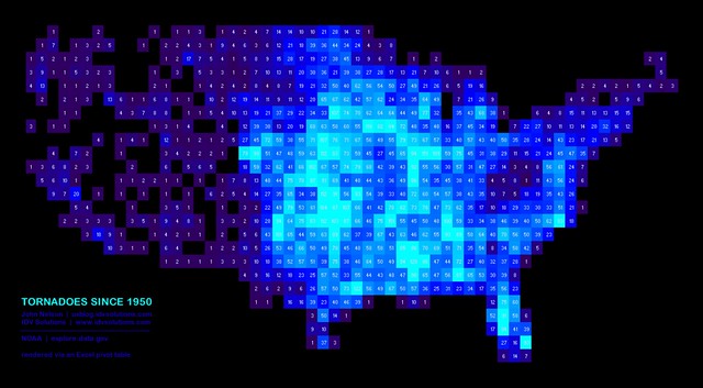
Decades and decades of tornadoes.

A bajillion historic hurricanes.
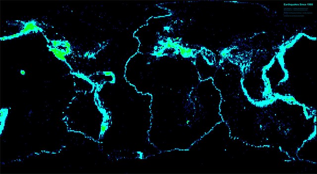
Over 100 years of earthquakes, AKA the tectonic plates of Earth.
If you have data with a lot of geographical "holes" you can group the lat and long values in the pivot table to create a dual histogram see this post (not mine) for how this might be done:
ReplyDeletehttp://datapigtechnologies.com/blog/index.php/creating-a-frequency-distribution-with-a-pivot-table/
This allows for the data to be closer to a true projection, and also eliminates the need for a rounded lat and long column.
This is great, thanks Ben! I'm going to try it out.
DeleteHow could a much smaller area be mapped? I'd like to map Washington DC but we have fewer traffic fatalities (natch) and all our long and lat integers are the same.
ReplyDeleteCan you try just rounding to hundredths or thousandths?
DeleteThank you! I couldn't figure out how to do that yestereday but got it today.
ReplyDeleteis it possible to let us download the excel spreadsheet? So we can play with it?
ReplyDeleteJohn
Cool maps! I described something similar in my Oct 25 and Nov 1 posts at www.spreadsheetjournalism.com.
ReplyDeleteThanks,
Abbott Katz
If you want the resulting map to be equirectangular, can't you just augment your dataset with zero data values at each latitude and longitude, like [(latmin+latinc,longmin,0),...,(latmax,longmin,0), and (latmin,longmin+longinc,0),...,(latmin,longmax,0)]?
ReplyDeleteThat way when you pivot, you get a row for each latitude, whether a fatality happened there or not.
I'm usually pivoting time data, and filling in hours or days, but it's the same concept.
Thanks,
Christopher Black
YES! Why didn't I think of that?? Thanks Christopher! And now that you mention it, that's what I had to do to make the tornado direction chart not have gaps in it -it just didn't occur to me to do it for the coordinates.
DeleteHere's that direction chart: http://uxblog.idvsolutions.com/2013/06/tornado-travel-map.html
Where you find data by longitude and latitude? I'm a beginner and would love to play around with this.
ReplyDeleteHi Peter, I'm glad you are interested in trying this out! A good data set to start with is the tornado data. You can find all sorts of files here: http://www.spc.noaa.gov/wcm/ But here is a direct link to 2013's tornado data which you can open directly in Excel:
Deletehttp://www.spc.noaa.gov/wcm/data/2013_torn.csv
And, because it is the federal government, here is a separate file to name the data columns:
http://www.spc.noaa.gov/wcm/data/2013_torn.csv
Let me know if you have any questions and I hope you share your results!
Hey, John, love this concept. Any chance you could share a mock map with the appropriately spaced columns and rows? Would love to adapt this into a project I'm working on.
ReplyDeleteHi Ryan, thanks for the kind words! Feel free to shoot me an email with more detail and I'll follow up.
DeleteCheers,
John