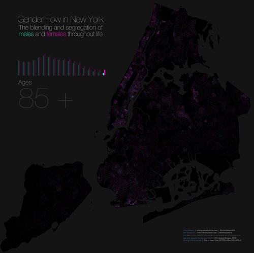
The sexes start out homogeneous go super segregated in the teen years, segregate for business in the twenty-somethings, and re-couple for co-habitation years. Then with the slow attrition of death, the lights fade into faint pockets of pink.
Click here for an unreasonably bonkers version, which will take an eternity to load.
Click here to pop out a more realistic file size for the web.
Click here for a pointlessly small size that's still too big to be an effective thumbnail.
Click here for a cute little thumbnail.
and here to insult me with your cowardice.
If you'd rather see them at-a-glance as an un-annotated set, you can go to their flickr page where they are tiled out sort of like a small multiple.
Data Sources
I'm using simple tract-level population/gender counts from the US Census Bureau. Because their tract boundaries extend into the water and vacant area, I used NYC's Bytes of the Big Apple zoning shapes to clip the census tracts to residentially zoned areas -giving me a more realistic (and more recognizable) definition of populated areas. The census breaks out their population counts by gender for five-year age spans ranging from teeny tiny infants through esteemed 85+ year-olds.
I had originally wanted to render the dots within the awesome actual building footprints of New York, but the census tract attribute in the PLUTO shapes are truncated and therefore largely useless for joining to other data. Believe me, I tried. Anyway, Brandon Martin-Anderson succeeded at this already and made a beautiful bi-variate dot map of olders & youngers.
Hat Tips
I, along with most other cartographers these days, am really into dot density mapping. It is way more truthful a means of presenting relative geographic dispersion and affiliation than, say, choropleth mapping, which will be the carto-whipping-post of 2013.
I was inspired by the perpetually excellent work and insights of dot density heroes, Brandon Martin-Anderson, with his bold 1-for-1 crazy-detailed dot mapping of populations, Andy Woodruff, who artfully pushes dots for his beloved Boston and articulates why with style and wit, Ken Fields, who shares thoughtful and detailed production insights, and especially Kirk Goldsberry, whose beautiful pointillist maps of Texan politi-culture was the first of this magnitude and aesthetic that I'd seen. Also, I've dabbled in it, too, making the obligatory election map, commuting maps, and walkability maps.
A Closer Look
Excluding color, this sequence of maps is a blooming, migration, and inevitable dimming, of life itself. The addition of the gender color dimension means we can track at a more familial level the lifeline of New York residents.
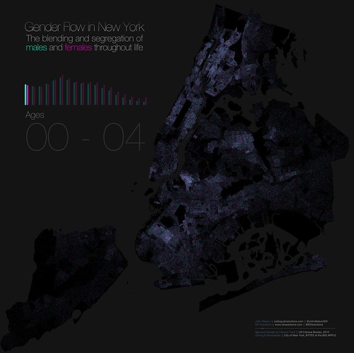
The population of babies. I expected this to be thoroughly blended, as babies don't choose where to live and parents don't really choose neighborhoods based on the gender of their babies.
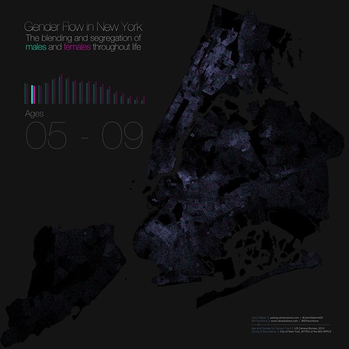
As with the map of infants, the genders are still understandably mixed. What is interesting in this age span is the general dearth of local youngsters in Lower and Midtown Manhattan.
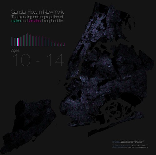
Certain neighborhoods begin to reveal themselves as comparatively popular places to raise teens.
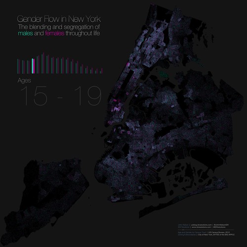
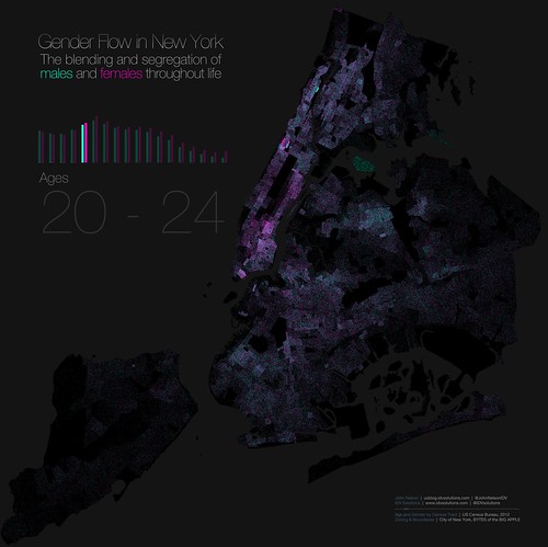
Now it gets interesting. We are in the age-span where teens/young adults can choose where to live. And they choose paths that are not gender-neutral. Immediately we see clusters of females and, to a lesser extent, clusters of males. What's the deal? College. And prisons.
Morningside Heights positively glows pink as the home of Barnard College, as do other institutions of learning sprinkled throughout Manhattan. The garment district is another draw.
We also start to see the filling of Rikers Island with green dots as young men begin to populate the jail complex.
Certainly a deviation in optimism between high-density young women neighborhoods and high-density young men neighborhoods.
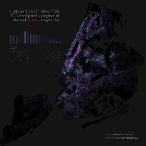
Now we reach the age of the young professional. Early twenty-somethings are nearing the end of their education and entering the workforce. For females, this apparently happens in Midtown Manhattan.
For males, the SUNY Maritime College, and Yeshiva University have a much higher local population of males than females. Also, of course, there is Rikers Island.
The Upper West Side and Upper East Side continue to be popular places for young women to live, but twenty-something men are showing up for work, too. Some areas of Queens show a greenish cloud of a male-heavy population. It appears as though women in their late twenties outnumber their male counterparts in Brooklyn.
Also notable in this age range is the migration to the suburbs. By the way, ages 25 - 29 is the most populous group of New Yorkers.
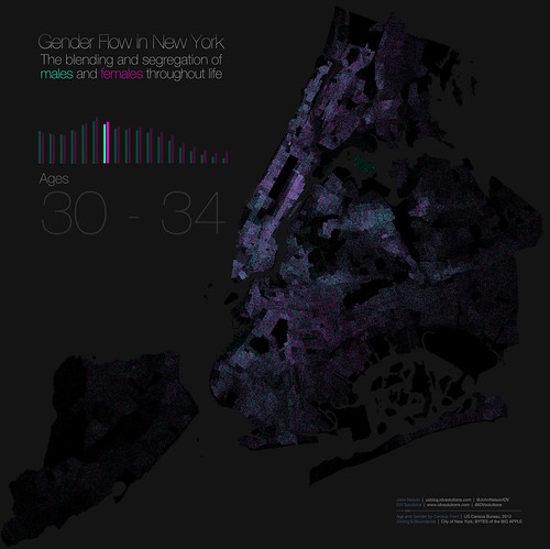
The early 30's shows the re-blending of the sexes, having been self-segregated since their early days out on their own. Not since infancy have the genders been so mingled. This 30-year echo is not a coincidence, since couples tend to create infants. Trust me.
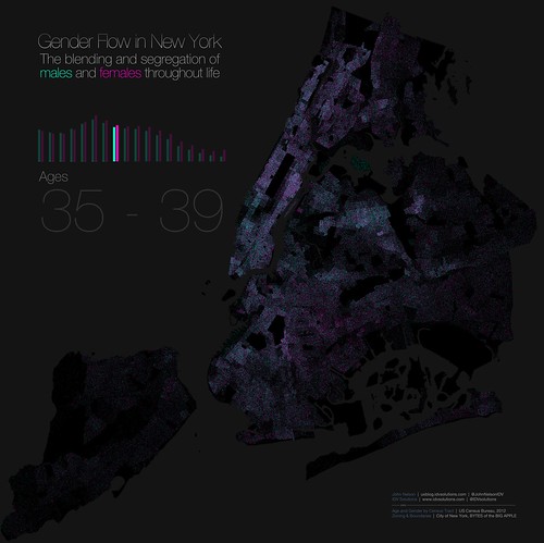
Superblending. Some neighborhoods are more gender stacked than others but for the most part male and female New Yorkers are blended. Brooklyn is still pretty in pink, and the Bronx increasingly so.
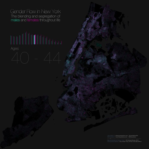
The early forties kicks off the re-segregation of the sexes. Dense pockets of women form in neighborhoods in Brooklyn -and one neighborhood in Queens just east of the river from Roosevelt Island coalesces with forty-something women.
Men are disproportionately (compared to similarly aged women) living around Chelsea.
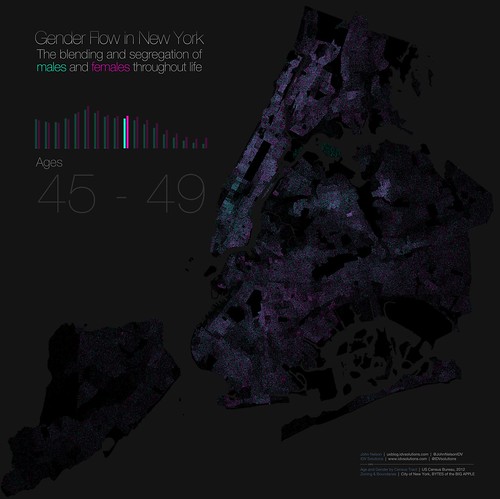
Men in their late forties continue to outnumber women in western Midtown. The proportion of women seems to increase at the edges of the city.
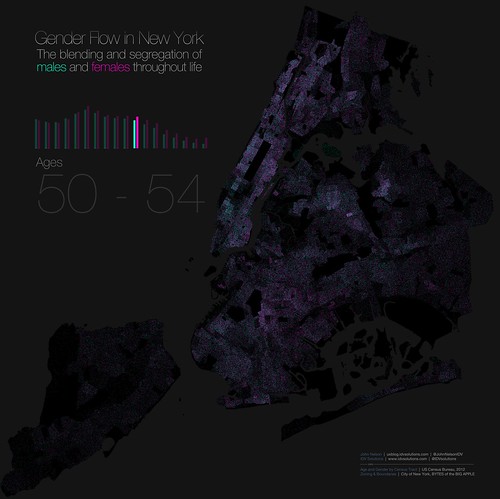
More of the same.
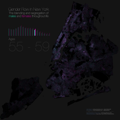
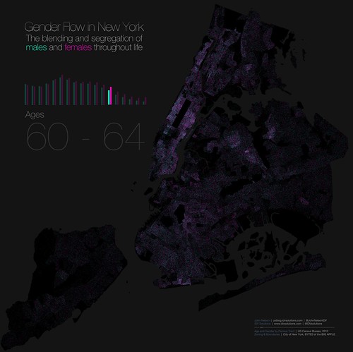
Overall, the diminishing population is apparent. But the Parkchester neighborhood in the Bronx remains popular with fifty-somethings of both ages. Female enclaves throughout the city continue to concentrate. Elmont, in Eastern Queens, seems an especially large popular residence of women in their late fifties.
As retirement age approaches, men begin to leave Midtown. Flushing and Elmhurst are relatively popular.
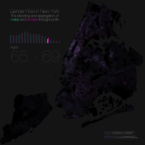
Men continue to fall at a faster rate than women, throughout the city.
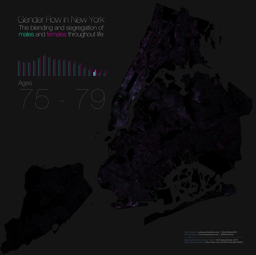
The lights are going out. Retirement communities in pockets of Manhattan and Brighton Beach emerge.
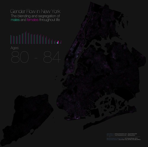
Two neighborhoods are holdouts for octogenarian men. They make a final stand in Brighton Beach and Turtle Bay.
At 85 and older, New York is essentially pink. Women outnumber the remaining men at a rate of better than two to one. Various retirement communities popular with women become apparent, almost as strongly as their geographic preferences in their teens and twenties. Those two eras mark their times without men, when whole neighborhoods are almost empty of males their peer. The boys have moved on.



Really interesting. I'm wondering if the concentration of men 30-50 in western Midtown (i.e., Chelsea and Hell's Kitchen) is a result of those neighborhoods being gay enclaves
ReplyDeleteDid you try to put the data for women and men on two separate maps and do the animation with the map side by side.
ReplyDeleteI'm finding it really difficult to read these, for the same reason why astronomical photos choose white as the background, a white background helps differences stand out to the eye more. Or perhaps it's glare on my screen (more visible with a black background), or perhaps because I have issues perceiving differences between some reds and greens...
ReplyDeleteI'd love to see these redone for the colorblind, I'm only slightly red/green color blind but have a horrible time seeing that these are talking about two colors (maybe do blue and yellow or bright red and bright blue....this pink and light purple thing is hard to see). Love the idea though.
ReplyDelete