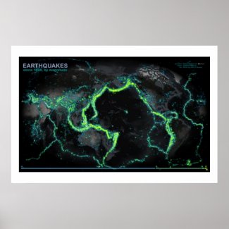
Here, data from NCEDC.org and the USGS and UC Berkeley have been sliced out into veneers based on magnitude, then glued onto and image that began it's life at NASA's Visual Earth and wrung into the Times projection (centered at the interesting bits). The result looks an awful lot like a fleet of Nickelodeon tankers spilled the world's supply of floam.
If historical epicenters were floaties, you could walk from Seattle to Wellington.
We only started recording hard core in the late 1960's. Also, you'd be right to assume that areas with more sensors record more earthquakes (but that's why they are there, so round and round we go), though they can pretty well pinpoint epicenters from all over.
You can order a poster print of this map than you should then mount within a flexible frame with unanchored pliable wall brackets behind shatterproof glass.
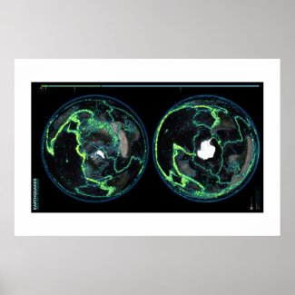
Same Thing, Different Perspective
Alternatively, here is the same data set duplicated in both north and south polar projections...
Prints
Other Sort-Of Related Maps
If this map is interesting to you, you might be amenable to plunging down the rabbit hole of related visualizations...


That's why they call it "the ring of [something]".
ReplyDeleteAlas, it's the only unanimated image.
"the ring of fire"
DeleteI can't identify the land masses, so it's just a pretty picture to me.
ReplyDeleteThe dot in the middle of the ring is Hawaii. SW from there find Australia. Does that get you oriented? ;)
DeleteWow. I guess we know who placed last in the Geography Bee.
DeleteFail.
And I felt stupid yesterday when my husband asked me where the Canary Islands are and I missed by a little less than 100 miles. No one should graduate high school without the ability to identify the continents.
DeleteI thought you were kidding at first.....Yeah, you've got to be kidding, right????
DeleteYou'll want to remain anonymous on that one, they're pretty obvious. Or to put it another way, if it was a rattlesnake, your leg has been tenderized by multiple bites.
DeleteI agree, it's hard to make out land masses and the detail is lost in the dark grey colour scheme: so very pretty of artistic value but frustrating to real people in the real world that will want to know about the earthquake activity in parts of the world that are important to them.
DeleteYes I have looked at the hi-res version and the detail is very difficult to see even when zooming in. In conclusion it raises more questions than it answers, so a lost opportunity.
I could kind of make them out, but it's not super obvious (Australia is obvious, obviously). I like that the land masses aren't super obvious, but I wish they were a little more obvious. Besides that, the map is truly awesome.
DeleteSome of the above replies are from the biggest doucheboxes I've encountered on the interwebz. Geographers have a continental-sized chip on their shoulders.
Ring of Fire
ReplyDeletePlate tectonics on display! Great image!!
ReplyDeleteSomeone mentioned the private revelations (that have mentioned earthquakes, volcanic eruptions, mega storms, among other things) given to a man named John Leary regarding things currently happening and things to come. He has a website using his name dot com. Someone then stated that he was disapproved by his Bishop. Whatever the Bishop asked of him, he complied. He is a practicing Catholic in good standing with his bishop, Matthew Clark of Rochester, NY, and has a priest spiritual director either appointed by or at least approved by him. So, as a Catholic, one is free to read, reflect and discern prayerfully the messages he has received, especially in light of Divine Revelation (Sacred Scripture & Tradition) as taught by the Magisterium (teaching authority) of the Church over the centuries, and what has already been accepted as having been communicated in the lives of canonized Saints.
ReplyDeleteToday's Random Unrelated Nonsense award goes to...
Delete+1
DeleteInteresting map John. I remember seeing a YouTube video submitted by a Japanese student that plotted Magnitude 6.0 and greater over time. This was about a year ago. I cannot locate the book mark for it right now but will look when I get the time. The final frame of the video looked very much like this. What you get from the video though was the earthquakes appeared to "progress" in a counter clockwise motion. I believe the video had some 2300 data points in it. Truly amazing. Thanks for the graphic.
ReplyDeleteYou're welcome, brah. http://www.youtube.com/watch?v=NSBjEvPH2j4
DeleteWow, that is a beautiful animation. And...thanks?
DeleteBeautiful image. The Japan EQ map someone references above can be found here - http://www.japanquakemap.com/
ReplyDelete(I think with the suggestion that if you had the ability to animate this map over time it would be fascinating to 'watch').
Nice graphic. I know the Ring of Fire is probably the most popular earthquake region to look at, but I was a bit disappointed that the Mediterranean was in shadow and split in half at the edges of the image. Any chance of getting a better look at Europe / Mediterranean / North Africa?
ReplyDeletePlease can we have it updated? There have been some pretty significant quakes and aftershocks since 2003.
ReplyDeleteI second this motion.
DeleteWow, great visualisation,, now if only we could see the location of the moon at the time of the quake and debunk the moon causes earthquakes theory. :)
ReplyDeleteCould you make quakes above 8 red..?
ReplyDeleteI wonder if that collection of extra bright lights is New Zealand.
ReplyDeleteI was just thinking that. There are so many pretty earthquake blobs that New Zealand is buried.
ReplyDeleteCurious how 20th century technology magnified the detailed knowledge of EVERYTHING.
ReplyDeleteBetter sensors and computers.
If there was only earthquake data from late 1960's, how did the people who put this together show earthquakes since 1898?
ReplyDeleteI wonder how many green dots in Nevada are from nukes?
ReplyDeleteGood question. Hopefully, none of them. I ran the query to exclude nukes and other explosions of known human cause (like mining). Interestingly, you can run the NCEDC form to get ONLY those events. I played with the data for a while thinking it would make a really interesting companion, but rejected it when i didn't see events of known nuclear explosions. But, what data there was, was mostly plastered all over Alaska. Check it out for yourself, it's crazy.
DeleteGreat Image! but where's Europe / Mediterranean / North Africa?
ReplyDeleteYup, I live in New Zealand and we had a 7.0 the other day depth 230km so not too dramatic, a 5.7 yesterday and a 4.8 in Christchurch. It is no wonder we are burried by bright lights on the map. I have fault lines running across my farm too. We have our emergency food box well stocked just in case. Great graphics, lots of work thanks for showing it to the world.
ReplyDeletewhere is europa???
ReplyDeleteIs there a reason the land masses underneath are so dimly lit? I can hardly make them out.
ReplyDeleteWhat interesting work!! I also like your tornado map. I guess there really is no place left to hide!
ReplyDeletePlease give me do you what's software program.
ReplyDeleteI need your software
Ok kiddies quit quibbling, just go to www.globalincidentmap.com, that shudgive you allthe information you will need...
ReplyDeleteEuropeans would enjoy this more if Europe were shown more clearly
ReplyDeleteVery nice work...Hellos from Chile!
ReplyDeleteHistoric earthquake data from NZ is available almost back to 1900
ReplyDeletehttp://www.geonet.org.nz/
This comment has been removed by the author.
ReplyDeleteIncredibly cool!
ReplyDeleteWhere can we buy these maps on posters for our geography and history classes?
ReplyDeleteThis is a great information...
ReplyDeleteemail retention
"I hate the colorblind." - the maker of this map
ReplyDelete