

A typographic map of Grand Rapids, Mi, fed demographic data in Visual Fusion
Background
Some time ago we saw FlowingData's post on the rocking typographic map of Boston by the folks at Axis Maps and promptly ordered one for the office (I also got one for my sister, a one-time Bostonian). For reasons that they do a much better job at describing, typographic maps are just appealing, and Axis has brought it to an art form. Typographic fills aren't necessarily new, but painting it in via a dynamic variable in a web mapping environment might me.

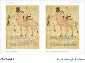

Verocchio's Measured Drawing of a Horse... and a Centaur from a Carolingian text, both cited in Tufte's Beautiful Evidence, use text to form the contours of the subject. And Abhishek, who sits next to me, happens to have a typographic map sweatshirt.
Examples with Demographic Data
Daniel Briggs, resident alchemist, wondered what it would be like to do a simplified, though dynamic, version where we could depict data in a web-based system. Below are some examples that use demographic trends as the text content. The color of the text is interpolated along a negative-neutral-positive track and the size of the text is a factor of the trend's magnitude...

Population trends in a Grand Rapids, Mi, neighborhood from 1990 to 2010. A particularly desirable tract near "Comstock Park" has more than tripled its population (though the relatively low populations of tracts make big proportional shifts over 20 years not all that outlandish).

Unemployment trends in a northern Flint, Mi, neighborhood over 25 years (1990 extrapolated through 2015). The news is generally not good.

Here is a southwestern Detroit, Mi, neighborhood's income trend. A muted aerial basemap has been pulled in to provide some context, with mixed results. By the way, you can see good old Tiger Stadium there on the right.
The requirement for a legend or key kind of melts away with typographic maps. The content itself is the key; the user does not have to keep a RAM version of a legend in their mind as they would when eyeing a typical choropleth map. The trade-off is an increase in texture and complexity (though not more than a typical aerial basemap would add). So, is it faster, more efficient? Maybe, but it's also just neat and when it comes to categorical or variable valued data, this seems promising.

Here is the Grand Rapids map with the rest of the VFX wrapper shown.

Also, thanks to Chris Abraham for his idea of scaling by magnitude, and Adam Flink for implementing it. And thanks to the folks at Axis maps for the inspiration.
Creation Samples and Line Support
The origin is a good old vector polygon or line and Visual Fusion's output generator renders the fill as a masked brick-row set of text. That text can be whatever you want, I suppose. In this cases above it was a calculated demographic rate, below it is simply the name of the item. Also in this example you can see what lines look like and the polygons are bordered by linear text as well. So, draw the stuff, or upload it from Oracle, SQL, SharePoint, Shapefiles, whatever and pick what fill properties you want. Here is MSU's Spartan Stadium...


Louis: [possessed by Vinz Clortho] I am The Keymaster!
ReplyDeleteDana Barrett: [possessed by Zuul] I am The Gatekeeper!
John Nelson: [possessed by average intelligence] The Map is the Key!