
A zonal approximation of the following map is available here. Read on for all of the glorious details...
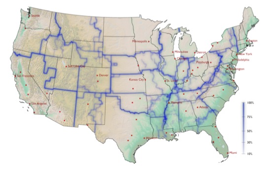
Northwestern University's ROCS's delineation of "effective communities" in the United States.
Some time ago a squad of mathaholics at Northwestern's Research on Complex Systems group used data from www.wheresgeorge.com to map a delineation of national communities, using the physical movement of dollar bills from county to county to feed a "stochastic Monte Carlo" (semi-random process with different results every time, run over and over again) algorithm that categorizes U.S. Counties into "effective communities." When run a thousand times, predominant lines begin to emerge, indicating boundaries of fluctuating strength. What a great way to crowd source out pragmatic economic zones. Check out their fun, and well-produced, video describing one of their methods:

Follow the money.
What is particularly amazing about the results is that the algorithm itself had no notion of spatial proximity when it did its grouping, and yet the regions tend to be wholly compact (instead of fuzzy sets of counties that may or may not actually touch each other). They also tend to trend along existing state borders or strong geographic features. So cool.
There are all sorts of things you could do with this data...except most of them require a format other than a flattened bitmap. So now what?
Why Convert?
While the idea, the process, and the map are fascinating, the result is an image of the United States with fuzzy lines representing varying strength or confidence and as such has relatively limited utility -aside from a visual reference. If you are comfortable enough with the trade-offs (below), converting this map into discrete vector zones opens up all sorts of uses.
Super Ultra Mega Caveat
We visually aggregated U.S. Counties into zones that we thought best reflected the borders in the Northwestern team's map. The result is a basic set of discrete communities across the United States.
BUT in doing so, all of the nuanced confidence that the original map depicts is lost, in favor of solid over-confident zones. It is a trade-off. If someone else were to take a crack at tracing these zones, they may well end up with a slightly different grouping (but not that different). So you can take that for whatever it's worth.

Take It
So, again, assuming you're comfortable with the trade-offs associated with creating these discrete zones, you can do any combination of things like...
- ...thematically shading by underlying population demographics, economic indicators, or internal data.
- Aggregate cases of infectious disease or treatment facilities within likely-trasmissible areas for zonal charting and reporting.
- Use it as a raw input reference to delineating business districts or sales territories.
- Add it into the mix of other data sets to provide context and gain more understanding from your ecosystem of data.
- Or go crazy and use these zones as a level-one regionalization for a United States of Craigslist map (which I did not do here).

The Northwestern ROCS 'effective communities' approximated into zones and tossed into Visual Fusion...where all sorts of crazy things can happen.
Download our approximation of these communities in either shapefile or kml file format here:
https://skydrive.live.com/?cid=2eb6aaf6c3ac1ebe&sc=documents&uc=2&id=2EB6AAF6C3AC1EBE%212242#
No comments:
Post a Comment