
The Electoral College is Weird
Whether you are fer it or agin it, there's no denying the oddness of the Electoral College. Here is an illustration of how differently your vote counts depending on your state. Here are some [spoiler alert] key takeaways...
- When it comes to the 2012 election, Utahans will get the biggest (+15%) per-person jump in election power, thanks to the new 2010 Census population counts.
- Did you know that in the 2012 election, one person in Wyoming will be worth more than three and a half Californians?
- California, New York, and Texas will have the least per-person sway in the Electoral College, while Wyoming, Washington DC, and Vermont will have the most.
- Most states are winner-take-all when it comes to who gets their Electoral College votes, but Maine and Nebraska are more nuanced (which is pretty awesome of them).

Here's what it looks like tiny and sideways. Click for the real deal...
The 100-Year Congressional Roller-Coaster
Depending on census counts, Congress divvy's up it's number of seats amongst the states -but every state gets at least one seat no matter how small the population. This means that from year to year the tug of war will inevitably end up with winners and losers. Here's what that tug of war looks like over the past 100 years. The tics paint a picture of national population shifting and growth patterns. And the line scores show how the apportionment math tries to keep up. Plus it's really tall.

Another tiny sideways infographic. Click to see it set right and big enough to read.
Gerrymandering!
Bwa-ha-ha-ha-ha, the power of geography is vast! He who controls the modifiable areal unit problem controls all!!! Here is a rundown of some really interesting extents to which the division of voters have taken us. Also, you'll bathe in the fine context of history and strategy. It's all a big game of Blokus.
American Enclaves
Ours in a nation of immigrants and migrants. Using the latest census data, check out where particular demographics tend to cluster in proportions far beyond their national average. The result is a look at the distribution of neighborhoods that paint a picture of this movement and the structure is builds on the American landscape. You can be sure that the folks ponying up the dough to buy ad-space in your area are aware of who lives there. So check it out for yourselves...

- Learn more about these American Enclaves.
- Click to explore these enclaves for yourself in an interactive map.
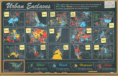
Click to embiggen. Or check out the available poster print.
Housing
Obviously the economy is an especially hot topic in this election, and much of that concern has to do with the tremendous amount of wealth (or virtual wealth) that evaporated in the form of equity. Here are a couple glimpses of housing issues over the past decade...

How has home vacancy changed over the past decade? A map of the best, worst, and everybody in-between.

A map of The 20 highest and 20 lowest home vacancy rates in the United States.
Old and Young
For more insight into the demographic engines driving the polls, here's a look at relative age in the United States. Pink areas identify populations that are much older than average, and blue areas are much younger than average.

Click for a larger view of where people are having kids, and where they've fled from kids!
A Curious Union
And lastly, we are about to enter into an election, cast our vote, and cross our fingers that others in our state and probably a few other key states, cast it the same way. Here is a sneak peak at how folks generally think of other states, and the sorts of questions they presume, providing pretty fun insight into our opinions of the other 49. (By the way, somebody did this same thing about a year later and it was all the rage. Shucks.)
These maps show, per state, what others are asking the Googles about them. Specifically...
"Why is [state]"
"Can [state]"
"When will [state]"

Tweet Follow @JohnNelsonIDV
Presidential elections don't have to be this way.
ReplyDeleteThe National Popular Vote bill would guarantee the Presidency to the candidate who receives the most popular votes in all 50 states (and DC).
Every vote, everywhere, would be politically relevant and equal in presidential elections. No more distorting and divisive red and blue state maps. There would no longer be a handful of 'battleground' states where voters and policies are more important than those of the voters in 80% of the states that now are just 'spectators' and ignored after the conventions.
When the bill is enacted by states possessing a majority of the electoral votes– enough electoral votes to elect a President (270 of 538), all the electoral votes from the enacting states would be awarded to the presidential candidate who receives the most popular votes in all 50 states and DC.
The presidential election system that we have today was not designed, anticipated, or favored by the Founding Fathers but, instead, is the product of decades of evolutionary change precipitated by the emergence of political parties and enactment by 48 states of winner-take-all laws, not mentioned, much less endorsed, in the Constitution.
The bill uses the power given to each state by the Founding Fathers in the Constitution to change how they award their electoral votes for President. Historically, virtually all of the major changes in the method of electing the President, including ending the requirement that only men who owned substantial property could vote and 48 current state-by-state winner-take-all laws, have come about by state legislative action.
In Gallup polls since 1944, only about 20% of the public has supported the current system of awarding all of a state's electoral votes to the presidential candidate who receives the most votes in each separate state (with about 70% opposed and about 10% undecided). Support for a national popular vote is strong among Republicans, Democrats, and Independent voters, as well as every demographic group in virtually every state surveyed in recent polls in recent closely divided Battleground states: CO – 68%, FL – 78%, IA 75%, MI – 73%, MO – 70%, NH – 69%, NV – 72%, NM– 76%, NC – 74%, OH – 70%, PA – 78%, VA – 74%, and WI – 71%; in Small states (3 to 5 electoral votes): AK – 70%, DC – 76%, DE – 75%, ID – 77%, ME – 77%, MT – 72%, NE 74%, NH – 69%, NV – 72%, NM – 76%, OK – 81%, RI – 74%, SD – 71%, UT – 70%, VT – 75%, WV – 81%, and WY – 69%; in Southern and Border states: AR – 80%, KY- 80%, MS – 77%, MO – 70%, NC – 74%, OK – 81%, SC – 71%, TN – 83%, VA – 74%, and WV – 81%; and in other states polled: AZ – 67%, CA – 70%, CT – 74%, MA – 73%, MN – 75%, NY – 79%, OR – 76%, and WA – 77%. Americans believe that the candidate who receives the most votes should win.
The bill has passed 31 state legislative chambers in 21 states. The bill has been enacted by 9 jurisdictions possessing 132 electoral votes - 49% of the 270 necessary to go into effect.
NationalPopularVote
Follow National Popular Vote on Facebook via NationalPopularVoteInc
Amazing datasets displayed amazingly well...but what you have labelled on the Urban Enclaves map as St. Louis is, in fact, Kansas City. It looks like it's been around for a while, so I'm kind of surprised if I'm the first to notice.
ReplyDeleteAh, thanks for the heads up! I'll look into it when I'm back behind a desk.
DeleteFascinating research. thank you. I spotted one error though: the American Enclaves examples poster labels the bottom right as St. Louis while it's actually Kansas City—I know, I live there. It is for sure a great example: the black population of Kansas City, MO was for the longest time de facto segregated east of Troost Avenue (the almost totally straight line on the western side of the blue area)
ReplyDeleteOops, I just noticed somebody else pointed out the StL/KC snafu already. Sorry about that
Delete