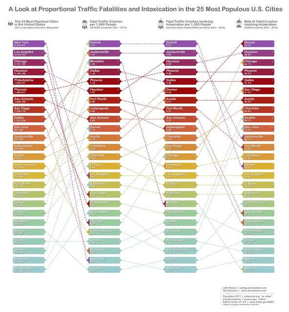
Find a city of interest and track its ups and downs across the *sorted lists.
Population?
This graph sort-of uses population as a proxy for the amount of driving that occurs overall. But because population doesn't correspond perfectly with driviness, what you get is a more nuanced characteristic of a city. Some really populous cities have a low rate of fatal crashes and there are lots of factors that could go into that, like the availability of public transportation, the walkability of the city, the general speed of road traffic, or some nature of the road infrastructure itself. And other stuff.
But because this list compares deadly crashes to the raw population of a place, a little more about a city's characteristics might arise and others can speculate as to what those may be.
Intoxication?
When a fatal traffic incident occurs, it's characteristics, including the nature of the involvement of intoxication, are collected by FARS. For this chart any instance of intoxication among those involved was considered.
Why the tangled mess?
That's the good stuff. Characterizing the general crisscrossiness between columns helps to interpret the relationship between a city's population and the traffic fatalities that happen there. For example, on the whole, very large cities tend to have a reduced per capita risk of traffic fatality. I might also assume that the ordering of per capita crashes would correspond pretty tightly with per capita drunk crashes -but several cities buck that prediction. So find a city of interest and track it through the lists to see how it travels. Here are some isolated examples...
Denver ranks 23 in terms of population, but comparatively high among that set when it comes to per capita deadly crashes, even higher when it comes to per capita deadly crashes involving intoxication, and right at the top of the list when it comes to the overall proportion of deadly crashes that involved intoxication.
Memphis has a smaller population but a comparatively high rate of deadly crashes. This overall rate of deadly crashes relative to population is so high that it makes the rate of intoxication involvement look tiny -even though it is relatively commensurate with the population.
New York has a massive population. But given that population it's a comparatively safe place to drive and scores angelically when it comes to drunk driving. Why? Maybe a generally low rate of vehicle ownership, a popular public transportation system, slower traffic, etc. Also maybe New Yorkers are just really careful, super swell folks who keep their hands at 10 and 2 and don't drive angry.
Detroit's rate of deadly crashes involving intoxication runs in the middle of the pack, but the per capita rate of deadly crashes (drunk and sober) are comparatively high. The signature of this disparity might indicate cities with a large suburban to urban population ratio, as pointed out by Henry Grabar at the Atlantic Cities (disparity between city resident population and amount of commuting traffic).
Forget about the 25 biggest cities, how about overall?
Ok. Here are the lists of the best and worst cities when it comes to the rate of deadly crashes that involved intoxication, over a decade of data...
(update: I noticed this list, while correct in percentage scores, was out of order. It is now in order)
Lowest rate
13.6% Birmingham, Alabama
13.7% Coral Springs, Florida
14.7% Memphis, Tennessee
14.8% Miramar, Florida
15.4% Provo, Utah
16.3% New York, New York
16.7% Surprise, Arizona
16.7% Hialeah, Florida
17.7% Salt Lake City, Utah
18.3% Miami Gardens, Florida
Highest rate
55.8% Stamford, Connecticut
55.6% Flint, Michigan
54.6% Bellevue, Washington
54.2% Denver, Colorado
54.2% Santa Maria, California
54.1% Colorado Springs, Colorado
52.6% Green Bay, Wisconsin
52.5% Billings, Montana
52.5% Lakewood, Colorado
52.3% Madison, Wisconsin
The areas used to sum up the incidents falling within are the same as the chart above, coming from the U.S. Census bureau's set of "place" boundaries. The list itself comes from the wikipedia's ranking of the 285 biggest cities in the U.S. And of course the traffic data comes from FARS coordinates and intoxication flags from 2001 through 2010.
Show me a map
Here is a more politically agnostic view of the data, spread out across the country within a generic equal-area hexagon mesh. The number of fatal crashes (symbol size) and their rate involving intoxication (color) show the dispersion, and DD proclivity of places. You can read more than you may care to about this map's methodology here.
Caveats (updated here 1/9/13)
This intoxication flag considers alcohol alone, based on blood alcohol tests provided in the reports. A BAC of 0.01 or greater by anybody involved in the fatality, not necessarily just the driver, is considered for the 2001-2007 years in this analysis. 2008, 09, and 10 limit that element only to drivers.
Here's the FARS Analytical Reference Guide:
www-nrd.nhtsa.dot.gov/Pubs/811352.pdf
and specifics about the interpretation of the drunk driving data element:
ftp://ftp.nhtsa.dot.gov/fars/FARS%20Files%20Errata%20Sheet.pdf


Bruce Segal posted this update using car ownership rather than population as a normalizer, which is a better metric. Here's his slide: http://www.slideshare.net/BruceESegal/besegal-census-data-of-population-w-access-to-vehicles
ReplyDelete