If you are anything like me, you spent a significant proportion of 5th grade blinking away terrified tears as you stared down long division and factor trees. But if I could conjure a picture in my head of what was going on I had a chance at the process. So, some years later, here are some economic measures and some meaningful ways of slapping them together, visually...
(pan and zoom around for a high-res look at the map math)
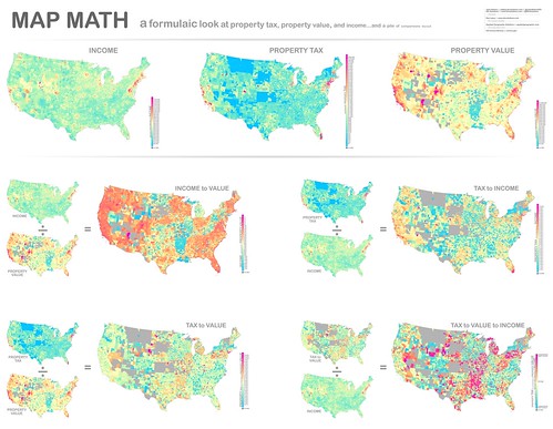
The most cheerful-looking set of economic ratios you are likely to see today. Download this sucker here, at various sizes.
This came about as a meandering next step following the traffic fatalities set of infographics, which spawned the drunk driving map, which encouraged the city-level rankings, which gave rise to the investigation into commuting methods, which led to the bike-ability walk-ability set of maps. Whewz. Anyways, a recent hire here at IDV, Dan Lipsy, was telling me about his considerations in refining candidate locations around ol' HQ here in Lansing to look at houses, which naturally included general property values and taxes. It got us to wondering how these things relate to each other even at a basic level. So we took a look at some 2012 economic estimates data via our partner AGS, and started generating some ratios. The results were interesting; some places surprising and others not so surprising. In any case these maps will certainly ask plenty more questions and we originally had -which is what I love.
Here's an overview look at the Map Math conglomeration. I can say with confidence that never has a set of ratios made me crave rainbow sherbet more than this...
Here are links to the individual maps if that is more your speed...
Estimated median household income in 2012. Notice the ring of wealth surrounding most every urban area (click the map to be taken to a superhuge readable version). It's easier to see in areas with smaller county subdivisions because you get a higher spatial resolution and the phenomenon gets painted in with finer detail. For what it's worth, I expected higher incomes in Pacific Northwest cities. Anybody able to chime in on that?
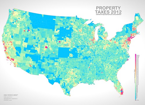
Estimated average property tax in 2012. Looks generally in sync with income (above), but we take a closer look a little farther down. Massachusetts surprised me. Vermont, too, for what it's worth. Anybody have some background on that?
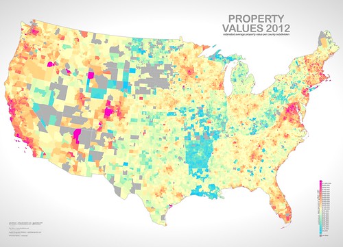
Estimated average property value in 2012. You can see the usual suspects of high dollar areas. Arkansas and Michigan's upper peninsula are on sale.
Ok, Math Time; Show Me the Ratios
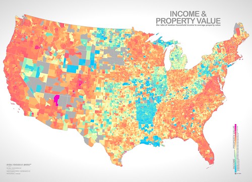
How does property value relate to income? Generally, locals may have an easier time finding land in the bluer areas while folks in the orange and pink areas may feel a pinch. But the ecological fallacy encourages us not to draw too strong a connection between the two when thinking about individuals. Case in point: I spent a really frugal year working on the island of Martha's Vineyard, where many of the houses are seasonal vacation homes. The property values are enormous and wholly incommensurate with the folks whose year-round incomes would be tied to the same geography. But, identifying those locations in this map is an interesting exercise as well. Generally, though, you get a sense for where folks are more or less house-poor.
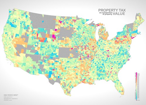
Typically property tax is commensurate with its value, more or less. Here's a look at that 'more or less' across the country. Some places really stand out and the coloration scale had to be pretty heavily tiered to pull out any of the middling values. Also, it's important to remember that property tax is not the only tax, but this specific comparison still yields some interesting structure.
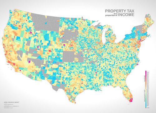
Are there places where the rate of property tax to income is incommensurately high or low? Blue areas show a relatively good deal in that regard while pink areas are proportionally costlier. Are you wondering how income tempers this? The next map normalizes for that.
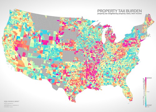
Ok, here is a more realistic look at the relative burden of property tax because it is weighted by both property value and average income (resulting in a unit-less metric). Property tax may be more of an issue for residents in the pink areas and more of an afterthought in the blue areas.
A bit about the color choice. I used a diverging scheme here, which is not a traditional (or at least conscious) choice of cartographers for a standard unidirectional low-to-high ramp. But, the nature of this data corresponds to the way we think about lots of financial notions, which is: show me normal, then show me the lesses and mores. Most of that nuance was lost with a monochromatic scheme so I broke with the carto-color-guide with great relish. Also, I really wanted to use the colors that my son, Juneau, used on this panda because it looked pretty awesome...
For information regarding prints of the United States of Ratios map, visit here.



United Van Lines, which we (and many other families) have used to do long-distance moves, conducts a yearly migration study.
ReplyDeleteIt may be interesting to some of you to see the correlation between low property tax burden and top inbound states as well as high property tax burden and top outbound states.
Here is the link to the 2011 United Van Lines Migration Study:
http://www.unitedvanlines.com/mover/united-newsroom/press-releases/2012/2011-united-van-lines-migration-study.htm
Here is the link to the 2012 United Van Lines Migration Study:
http://www.unitedvanlines.com/mover/united-newsroom/press-releases/2013/2012-united-van-lines-migration-study.htm
Thanks for posting, John.
Best,
Dan
As a Chicago resident, I'm glad to see that Illinois has a very good Income to Property Value ratio. Our state is in financial dires, but at least people's income is better than their property value. I think one of the most huge challenges that America faces with the housing crisis is that people's property is value way too high. So high that people can't afford to buy anything anymore. But Illinois looks like we are a good sea of blue and green in a nation of red and orange.
ReplyDeleteInteresting post, as usual. Information is abundant and clear. The software you are using really makes great maps. Thanks for sharing.
ReplyDeleteVery interesting set of maps. We have a group at our office that is working to characterize coastal and ocean data. http://www.csc.noaa.gov/digitalcoast/data/enow. I'm going to pass this along to them because I think your approach might give them some new ideas. There may be some data on that site that you could use. It's mostly focused on coast though. I like your color choices too. Juneau knows his stuff. :)
ReplyDeleteInterested in knowing where you got the data for property values? Could you share that info? Great maps!
ReplyDeleteGreat maps. I'm wondering why NYC is shown to have relatively low property values. On the Property Value map, Brooklyn, Manhattan, and Staten Island are all shown to be much cheaper than I imagine they could be in real life. Also, is this property value of land, residential construction, etc.? Super interested in finding out more or seeing data sources.
ReplyDelete