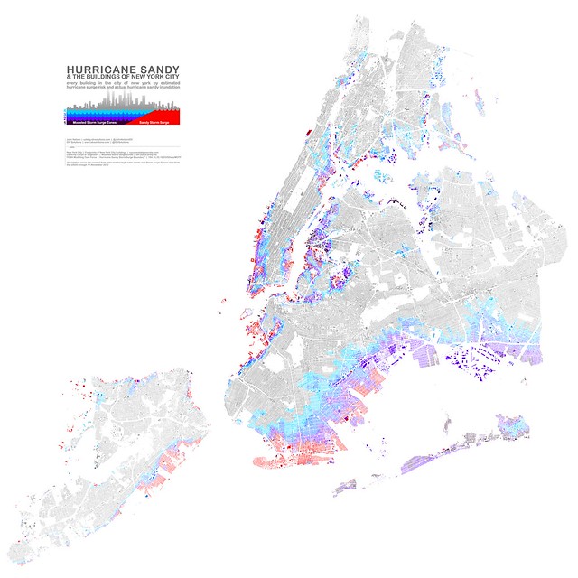
This map paints the surface footprint of every building in the city of New York (pre-Sandy) by where it stands in relation to modeled flood risk from a general storm surge of hurricanes, categories 1 - 4 (dark to bright blues), and by actual Hurricane Sandy highwater (red) painted atop. The context of the building shapes, provided as open data by the City of New York, helps to provide a general where's-it reference and is also a specific enough resource to find individual buildings.
Modeled hurricane surge zones and actual Hurricane Sandy surge zone painted over every building in New York City.
Note, you can click on any of the static images to go to a Flickr page with various size options. When there choose "Original," to load a ridiculously large full-resolution version what will swamp your browser.
Here's the slippy slappy tiled version to explore with less overhead...
Modeled and Actual, Broken Out
Hurricane flood modeling has to, necessarily, assume an impossibly generic storm. Each storm, though, has its own unique combination of characteristics and angles of approach so that reality will look somewhat different than the generalized risk zones. This map highlights both the variability of risk estimates and also shows where models were remarkably consistent with Sandy. Subways and other tunnels were of course flooded in the wake of Sandy's surge though these subterranean features are not rendered here -only surface buildings.
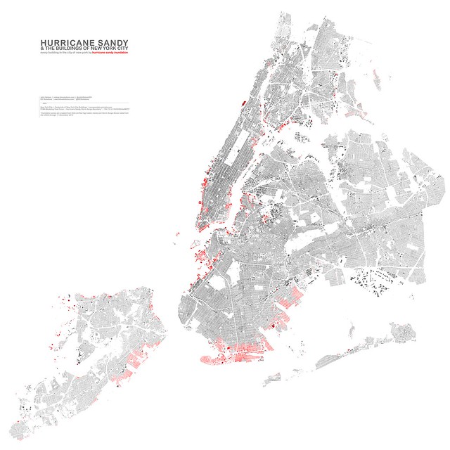
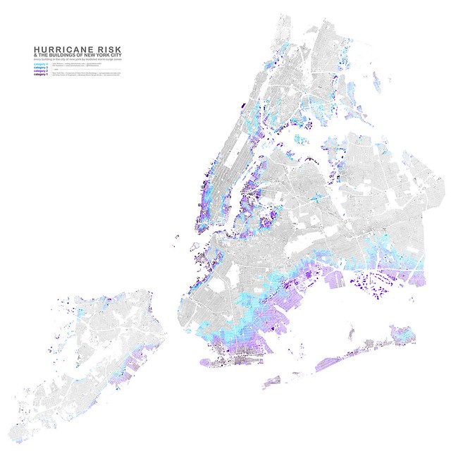
If the combination of modeled and Sandy storm surges is getting in the way then here they are separated out for a more segregated look at the two...
Just Sandy.
Just the modeled zones.
Data
The extent of Sandy's surge
The Hurricane Sandy storm surge boundary was created by the FEMA Modeling Task Force and is available here: http://184.72.33.183/GISData/MOTF/
And a small note about the method: All products are created from field-verified high water marks and Storm Surge Sensor data from the USGS through 11-November 2012.
The modeled storm surge zones
The US Army Corps of Engineers models hypothetical storm surge inundation zones, by hurricane scale. This is the modeling for New York State: http://www.iwr.usace.army.mil/nhp/HES/NY/Current2009HES/StormSurgeGISData/NYS%20Storm%20Surges.zip
Note, I just heard FEMA has updated their flood maps for the NYC area, but this is a different data source.
Footprints of every building in NYC
The City of New York put together a herculean vectorization of every building footprint in the city and provided it opengov to the public. I downloaded it here: https://nycopendata.socrata.com/Facilities-and-Structures/Building-Footprints/xe92-xce7
For information regarding prints of the Sandy + Modeled map, visit here. For just the Sandy map, visit here.
Tweet Follow @JohnNelsonIDV Follow @IDVSolutions


This comment has been removed by a blog administrator.
ReplyDeleteTesla and Elon Musk
ReplyDeletehttp://www.youtube.com/watch?v=SrzMdoKPPaA
This is a first for me. Pro-Elon Musk rap whiteboard spam. Holy crap that packs a lot in.
Delete