So whether you are a CIA analyst producing intel maps to help track down and decommission the rogue and dangerous Jason Bourne, or you are providing technical support for Chloe O'Brian, stop reading -you already wrote the book on this. For everybody else, here's a carto-nerd how and why about severe satellite basemaps...
Ingredients
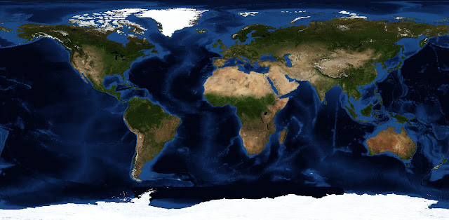
NASA's Visible Earth catalog includes a great set of Blue Marble images, which are cloud-free satellite mosaics of Earth, available for all sorts of months, styles, and sizes, and some fun derivatives. So check it out and download willy-nilly -you will not regret it. Let's make our own derivatives...
Blue Marble imagery comes by default in an equirectangular projection. This is a useful default, but get it into some other projection as fast as you can.

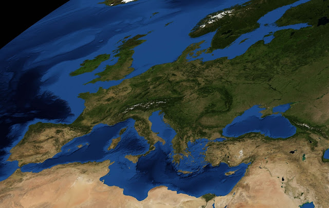
In whatever GIS package you are using, define the coordinate system (EPSG 4326) and geographic extents (global) so your image becomes spatially sentient. Then you can tell it to warp into all sorts of cool projections. In this example, I chose Loximuthal, which was invented by Siemon and later the epic Waldo Tobler, and zoomed in on Europe for no particular reason. Then I exported this satellite image for further fun as a layer in a graphic design program. Don't ever do your derivative's graphical/layout work in a GIS program. Specialize, man! I use Fireworks and the Gimp about equally (Gimp is way more performant with ginormous images though, plus it is free).

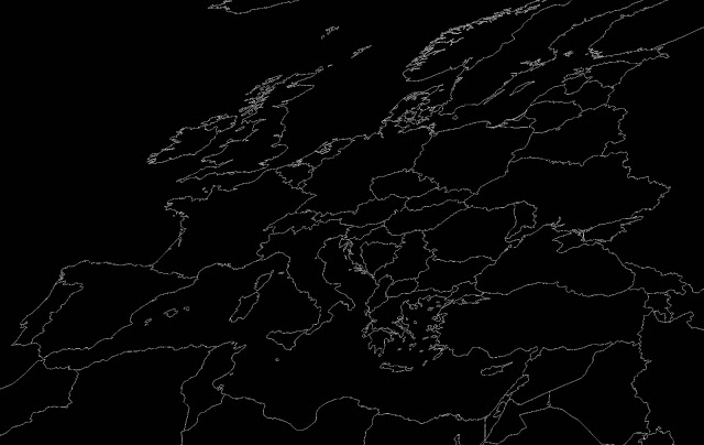
I also exported a country outline...

And a graticule reference...
Treatment
When satellite image is used as a basemap, I like to desaturate the tarnation out of it (-80%). Why? Because the Blue Marble imagery, while rich and beautiful when it's all you are supposed to be looking at, is intended in this case only to provide context. And the best way to establish content as ground is to desaturate it. Also, satellite imagery tends to look inherently more intriguing when desaturated. The LOTR extended DVDs taught me this.
I remember hearing a color corrector for the Lord of the Rings films describe how digitally reducing the saturation of the Shire's greenness in post production made the whole scene somehow look more verdant. It blew my mind and so I started dong that with aerial images that support data overlays and haven't looked back.
Depending on what sort of thing you're mapping, the addition of some political boundaries provides more context...
...but context should be muted. Now they have an earthy glow and are almost entirely transparent (80%).
Now some graticules. This you can take or leave. Mostly I think they just look cool, but if you have a really wonky projection they can provide needed bearing...
...but remember, they aren't that important, so give them the treatment.
And here's what you've got so far. But in order for this satellite-sourced basemap to be truly severe, it needs a hard-hitting vignette.
Seriously, like a really severe vignette.
And there you go. A vignette, while rocking all sorts of drama, has a practical purpose as well. When I was a photography student it was all about dodging and burning (with little cardboard-on-wire paddles). This is the cartographer's burn. Static maps end abruptly at their edge -that's where the world ends and there's nothing you can do about it. What a vignette does is help draw the eye into the map and also serves as a feathering out of cognitive investment cues. Which is to say it is a welcome neatline buster. Neatlines are, generally, your enemy. If you are good enough to get away with a neatline then go for it but only for really awesome reasons. Daniel Huffman goes into more detail on neatline wariness here.
I really flew past the whole projection part, but it is seriously the most interesting. Depending on what your map is showing and where your data is dispersed, try out something bold that works and center/crop. Just don't leave it in Equirectangular and don't go through the trouble of projecting and then just choose Mercator. Here are six quick variants...
Tweet Follow @JohnNelsonIDV Follow @IDVSolutions


How severe a vignette? I really prefer nice Raspberry, but a severe vignette probably means something like Habanero Vignette or Cinnamon Vignette, something with a strong red vinegar base and triple virgin olive oil...
ReplyDeleteJohn, do you know of a WMS server that produces anything like this? I use the standard Blue Marble from the NASA WMS, but this would be so much better for many applications.
ReplyDeleteI'm not aware of a pre-desaturated satellite WMS (anybody?), but maybe you could apply a client-side image filter in the browser. This might help: http://www.html5rocks.com/en/tutorials/canvas/imagefilters/
Delete