Monday, June 25, 2012

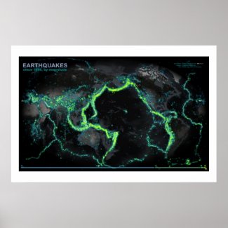
Earthquakes since 1898

I've been looking at really general sources of existential risk and visualizing them via the kitchen sink school of thematic mapping.  So the earthquakes map was just a matter of time.
Here, data from NCEDC.org and the USGS and UC Berkeley have been sliced out into veneers based on magnitude, then glued onto and image that began it's life at NASA's Visual Earth and wrung into the Times projection (centered at the interesting bits).  The result looks an awful lot like a fleet of Nickelodeon tankers spilled the world's supply of floam.

If historical epicenters were floaties, you could walk from Seattle to Wellington.

We only started recording hard core in the late 1960's.  Also, you'd be right to assume that areas with more sensors record more earthquakes (but that's why they are there, so round and round we go), though they can pretty well pinpoint epicenters from all over.

You can order a poster print of this map than you should then mount within a flexible frame with unanchored pliable wall brackets behind shatterproof glass.

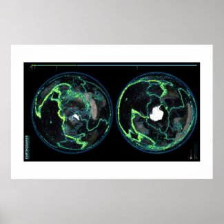
Same Thing, Different Perspective
Alternatively, here is the same data set duplicated in both north and south polar projections...


Prints

Other Sort-Of Related Maps
If this map is interesting to you, you might be amenable to plunging down the rabbit hole of related visualizations...


Wednesday, June 20, 2012

Animated Tornado Tracks over 61 years

Using data from NOAA, exported as a heap of images via Visual Fusion, the Tornado Tracks map has been smooshed through the animation ringer to illustrate 61 years of tornado activity through time.

by year...

Pro tip: check out 1974 and 2011.

by month...

Pro tip: check out the seasonal march north every year, and try out the HD option for full-screen crispiness.

Adam Hill, current Freaky Friday champion, made the interactive version of Tornado Tracks.  Deb Davis honed its towering heap of exported map images into these animations.

Set of related tornado tracks infographics:


Monday, June 18, 2012

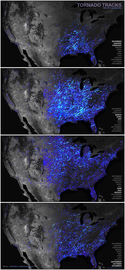
Seasonal Tornado Habitats, 1950 - 2011

Here's a visualization of seasonal tornado risk over a sixty-one year period.  The migration patterns of tornadoes look a lot like those of snowbirds (leading to the obvious conclusion that retirees cause tornadoes).


Seasonality of tornado tracks over sixty-one years.

1950 – 2011.  Data courtesy NOAA, visuals exported from Visual Fusion.


Friday, June 15, 2012

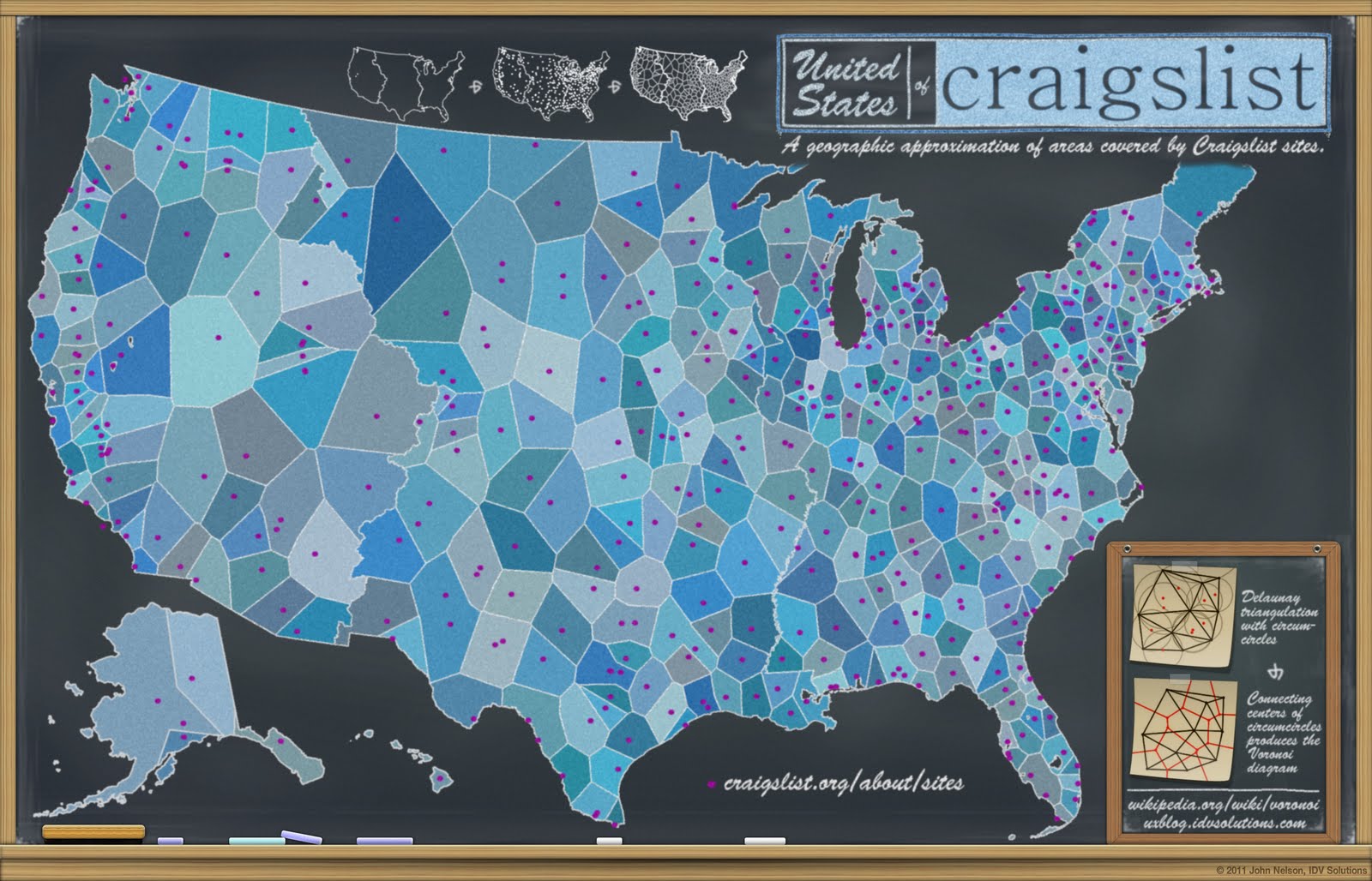
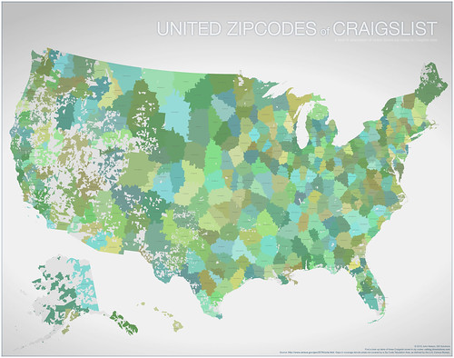
Follow-Up on the United States of Craigslist

Regarding This...


Here's what a commenter named "K" or "twodogkd" wrote (who I infer to possibly be the dude who...drumroll...was a keymaster of Craigslist sites).  If so, looks like the method was, appropriately, a thoughtful manual research process honoring the variable scale and habits of communities.  Especially interesting was the (initial) CL site criteria:

  • international destination
  • has international airport
  • a computer connected population


Humm,

As I worked for a few years early on responding to those requesting CL cities sites, I find this map interesting. I would tell some folks they could not or should not have their own CL site as they were too close to existing CL sites.

I tried clicking on an individual area like the Inland Empire which is Riverside and San Bernardino Counties in CA (except for areas near Palm Springs that has its own CL site as they met the criteria (international destination, has international airport, a computer connected population)

twodogkd
Riverside CA

Fast-following second comment...

I can comment more about some regions when I CAN SEE THE DETAILS of the map produced to better see what areas ended up within the same sections.


It may be that some things do not make sense such as for people who live on the Nevada side of the Sierra Nevada where they live on a geographic north south corridor along US HIGHWAY 395, so chopping that up into sections going into Nevada may not make sense since folks along that road either drive up towards tahoe/reno to shop or drive down to shop.


When I considered geographic areas that should be included in a Craiglist site, I did quite a bit of research using the wikipedia for the City, County, State, etc as needed to learn about the city/site and surrounding areas AND ALSO looked at the nearest Craigslist cities/sites.


One issue with Craigslist is ONCE they GO SMALL it is hard to broaden out.


I believe some Craigslist sites get TOO SMALL such that what would be ones "COMMUNITY AREA" or the area folks are normally drive and travel in the normal course of their lives may vary from area to area. In the Inland Empire (Riverside and San Bernardino Counties) many of us tend not to think much of traveling 60 to 80 miles and do so much more frequently and for some daily. Also there is much crossover between Riverside and San Bernardino with many Riverside citizens attending college in San Bernardino for example.


Craiglist is about COMMUNITY so the geographic areas selected should reflect that to the extent it makes sense to do so.


Regarding This...


In other news, Steven Brown wrote me with a revised set of zip-codes to Craigslist sites, which I am making available to you here.  I can't vouch for it's awesomeness, but you can have at it yourself if you like...

http://dl.dropbox.com/u/17180596/StevesUpdatedCraigsZipsLookup.zip


Wednesday, June 13, 2012

Constellations of Love and Hate

This image was made up of tweets that either contain the word "love" or "hate" sampled randomly over a few weeks.  They also happen to be geo-tagged, so this army of cartographic agents assemble themselves into a relative distribution of love and hate in New York City...


See that island of love in the upper left portion of the map?  What's going on there?  Turns out, it is an island of overwhelmingly positive sentiment whipped up by concert goers at the New Meadowlands Staduim!  And what's the deal with the enclave of love on Essex between Delancey and E. Houston?  Check out the love on Broadway, and even Hell's Kitchen.  Clear structure.

Patterns of hate tend to not be as clustered and distinct as love, but they do seem to assemble themselves into seams and corridors that I'd guess have to do with people hating traffic.  Does anybody know which roads look especially hate-inducing (I don't know NYC that well)?

Here are some insets that I found interesting, but I wonder if more fluent New Yorkers detect others...

Favorable reviews on Broadway.

A generally cool Jersey City crowd.

Folks just loving Essex.

Glum tweets at La Guardia.

Stuck in traffic?

Overall, a pretty positive Midtown.

Structured love in Brooklyn.

Loving the Queens Library.

Concert-goers love what they see.

A happy neighborhood in the West East 80s.


We've been working with the Twitter API lately as a way of not just supplementing risk/opportunity applications but as an honest-to-goodness source of spatially and temporally referenced sentiment.  While many maps will plot the locations of tweets, that visual becomes much more meaningful when the stream of tweets is filtered by some keyword.  The result is a spatial arrangement of...something.  That something can be tangible, like "bridge," (tweets rush in to show you exactly where bridges are) or something a little more vague like neighborhood names (tweets assemble themselves into tight groups that look an awful lot like a political map), all the way to ethereal topics like...love and hate.  When these abstract keywords are paired with their reasonable opposites, an emotional map begins to form, a map of the relative proportion of the two that paints in pockets of love and corridors of hate that are distinct, forming clear and heterogeneous patterns.  For what it's worth, even areas of pretty thorough mixing tend to show structure as well.

Mountains of social data, when viewed broadly and categorically, can illustrate trends as they happen and where they happen and the results are timely, barometric, and potentially surprising.  It's also pretty fun.

Check out poster print options here so you can hang this proudly in your loft with park views and exposed brick...
http://www.zazzle.com/nyc_constellations_of_love_and_hate_print-228998422729947885?gl=IDVSwag&rf=238195331830200304


Tuesday, June 12, 2012

Spatial Analysis Holds Court

Congratulations to my old adviser at Michigan State University, Kirk Goldsberry, for his clever and beautiful spatial analysis of NBA player performance!  His work has recently been showcased in the New York Times, and is an excellent example of the broad value of visualization and spatial understanding.

Location is location, and Goldsberry's focus on the court as just another spatial domain has opened a lot of eyes to the capabilities of geographic/geometric thought and he's done it in style!

Check out this analysis of shooting patterns of players in this year's NBA finals, and go full-on geek diving into this article Goldsberry submitted to the Sloan Sports Conference on the utility and value of spatial analytics in sport.


source: Kirk Goldsberry via the New York Times.


More on Courtvision here.

Monday, June 4, 2012

Zazzle Print: Tornado Tracks

We've been Zazzle-ifying prints of some visualizations we've cobbled together, so you can now take some snappy cartography home with you -to hang in your closet, place under musty newspaper piles in your unfinished attic, or positioned menacingly in the northwest-facing corner of your home or office.  Here's the tornado tracks print of 56 years of tornado tracks all glommed together, with a small-multiple set of maps breaking out F-Scale in the footer...

Zazzle print options here.


I'm going to buy one for my Mom, in a softball attempt to win approval.


Friday, June 1, 2012

Tornado Tracks by F-Scale, a Small Multiple

There was an unexpected and fun response to the tornado tracks map taking the uxblog's readership from an audience of 14 to at least double that!  Anyways, I've been asked by a few folks to separate out the storms by F-Scale.  So here is a not-very-small small multiple of how that would look.  56 years of tornadoes all at once, chunked out by severity...


Related poster print version available here.