#1: Aggregate reluctantly.
Rolling up data into bigger chunks removes information. When you do that geographically, you inherently degrade the resolution of the data and maybe mislead (on the flip-side you get a tidy summary of a phenomenon...that may or may not be true). But almost certainly you make it look less-cool. People are shockingly good at detecting patterns from noise (sometimes too good). Maybe it's a good call to aggregate your map data into bigger units and that's the way to go, but don't just do it as a knee-jerk reaction to a big data set. I mapped on mental cruise-control in that way for a long tome and in hindsight missed out on lots of cool opportunities.
Aggregation inherently diminishes nuance.
Which map will give Bear a more realistic sense of the political landscape of his fellow citizens? From Election 2012.
Which map will give Bear a more realistic sense of the political landscape of his fellow citizens? From Election 2012.
#2: Makers need to make. Give them the chance or they'll move on.
If you are a cartographer, or hire cartographers, the ones that are any good are the ones that have maps in them that are going to come out one way or another. If a maker doesn't have a creative outlet for their own ideas, they will feel a diminished sense of purpose as the fine abrasion of solving other people's problems wears down the sharpness of their intrinsic satisfaction.
Seeking Truth is one of the three pillars of motivation in the human endeavor, according to the compact framework of Plato (by way of Jeffrey Wagner).
A solid portion of official time spent mapping what you feel like will make a you as a cartographer more intrinsically motivated, more curious about and practiced in alternative methods, more tuned-in to the community, and more invested in the rest of the work you do. You'll be better. Or you'll find yourself mysteriously interested in other opportunities.
I don't have a graphic for this one.
#3: Defaults are evil! Stay away from the defaults!
You are not among the legion of mappers that are happy to crank out a GIS-ville map where not a single default was considered and changed. But if you were...
Default whats? Default projection (Equirectangular, see #14), default colors, default range classification (whatever the GIS threw at you -probably "natural breaks"), default range labels (truncated attribute names with underscores) default auto-layouts full of huge north arrows, overzealous neatlines, and scalebars that label in meaningless units and precision.
Defaults are nice because they let us see our stuff right away without manually setting 19 preferences before any data is rendered. But that's it. Change each and every one, because you thought about them. I've made plenty of ugly maps in my life, and they were usually the result of my lazy acceptance of the default assembly line.
Daniel Huffman did a great job of helpfully describing why certain maps fail, over at Cartastrphe. I recognize lots of default-ridden examples in there.
I made this unfairly poor map, using the magic of defaults.
He hates these cans! Stay away from the cans! In this illustration...the cans are defaults. And I'm Navin.
#4: Can your legend double as a supporting chart? That liability is now an asset.
Legends are like collateral damage. An unfortunate reality of getting a job done. They only exist because the map is too hard to decipher on its own and needs a de-coder tool, and often, that's just the way it is. But if you can add a dimension of data into the legend then it becomes a chart and pulls its own weight. You can think of this in reverse, too. If your map has a companion chart (which is awesome), use the same colors, for example, as the map and in that way they support and explain each other (then just scrap that dead weight legend).
In this case, the chart steals the show while also serving to legend the maps. From Tornado Travel Map.
Acts of piracy color-coded to time makes a helpful chart and removes the need for a dedicated legend. From the Piracy Top 5.
#5: Does your phenomenon care about political boundaries? Maybe not.
Political units are the most over-used geometry in mapping. They are really convenient because you can download them anywhere and the lion's share of geographic data is already aggregated into those areas. And that's fine. But remember that you aren't mapping data, you are mapping a phenomenon. And if your phenomenon couldn't care less about counties, states, and countries (pretty much anything that doesn't involve humans) then neither should you.
BUT even if your phenomenon doesn't care about political boundaries, adding them in as a faint reference will provide geographic context.
A tornado doesn't care what state it passes through. But adding a minimal state reference helps readers orient themselves and identify familiar places ("What's up with the tornado-free zone around West Virginia?"). From Tornado Tracks.
#6: Only aggregate to political boundaries if you want to (should) pin the phenomenon to politics.
This is pretty similar to #6, but its overuse bears some repeating. What should you stuff into political polygons? Anything that you want to associate with a politician or a cultural identity. This includes the bulk of social scienc-y data, like population demographics, economic measures, and cultural characteristics and perceptions. Even if mapping to political areas is the way to go, consider something other than a boring old choropleth. Mapping data to political shapes does not automatically mean you make a choropleth.
Identifying specific counties with extremes in home vacancy rates is a natural fit for mapping with political areas. From Lights Out.
Sometimes the desire to attach a cultural place (building footprints) with a natural phenomenon (hurricane flooding) is such that that you take efforts to cram a-political data into political zones (as a means of personalizing a phenomenon using relateable places). From Sandy and the Buildings of NYC.
#7: To animate or to small-multiple? Just make both.
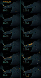
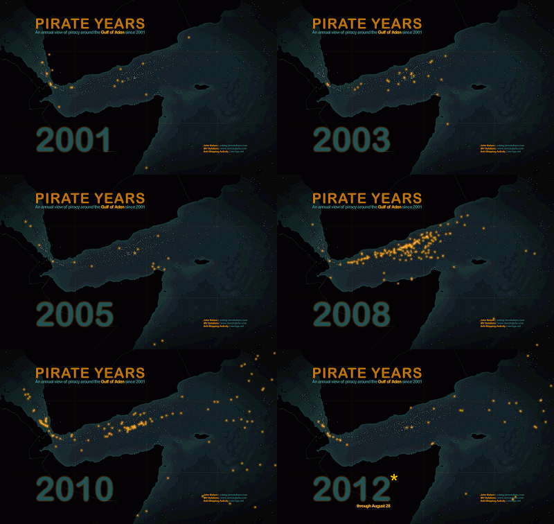
Seriously. If you've made one then you've pretty much made the other. Throw them both out there and let folks get insights via either one. Do you get more out of cartoons or comics? Here's a cartoon of the comic, and here's a comic of the cartoon.
But, if you do animate, be wary of interpolated (guesses) transitions between stops (knowns). Long smooth transitions damage change detection -which is why you are animating in the first place. Readers will notice more change in a flip-book style animation than when there is a longer transition (short-term memory leaks between data A and data B); the "pleasing" transition inherently disguises differences.


You have the materials for both if you have them for either. Just release the both of them and hedge your carto bets.
From Somali Pirate Years.
From Somali Pirate Years.
#8: Were you asked to use a dozen colors to denote categories? Run, it’s a trap!
This is one of those instances where you should hear what you are asked to do but listen for the actual problem to solve. This is a really big issue and a huge (and valuable) skill to develop. You were hired for your expertise, so don't be timid to respectfully propose preferred alternatives to a client. But be ready to rationalize it. I use this example because it seems to be the most common evidence in the map-making world of the gap between assuming the role of a technical resource (cog) vs. being a knowledge worker. "Make them different colors" is easy to request but try to deliver an actual solution, rather than scratch off a task item (this is more easily said than done depending on the customer).
Since you know that our visual system is increasingly terrible at differentiating beyond a handful of hues, it's ok to suggest strategies that are effective (and likely more aesthetically pleasing).
Don't do this (sorry Guardian).
#9: Did you make it? Put your name on it! Were you influenced by others? Hat tips all around!
Always sign your work. There is no better quality assurance measure than stamping your name to something. If you are designing in autonomy it can be too easy to crank out sub-par work. And on the flip side, you ought to be proud of the work you've done and it's right to attach ownership in this little way. Earned esteem is another of the big three motivators. Don't be ashamed by it, on balance.
The cartographic community isn't huge, and like any ecosystem we're influenced and inspired by others. That's terrific, and much of the fun of being among a group of familiar faces is the leapfrogging that might not happen in a professional vacuum. Just be generous in the citations and hat tips you attach to your work. If your map is an extrapolation of somebody else's map, say so -they'll probably be excited to see it. If yours is an exercise in applying somebody else's aesthetics to some new data, say so -they'll likely be honored. Plus, you'll increase your audience and maybe find yourself to be an exciting thread in your own professional network.
Develop a citation layout that you like and try to be consistent with it. If you have a writing domain like a map blog or Visual.ly, you can elaborate on the cast of influential characters there. From Election 2012.
#10: Can you get away with encoding color right in your map's title and scrap the “legend”? Go for it.
Sometimes the phenomenon you are mapping only needs a little bit of help to let the user know what they are seeing. Especially when you are using a few colors to represent different categories. If you can, try coloring the names of the categories right in the map's title and do away with the overly literal math equation (this = that).
The largely-pictoral title of a commuting map intrinsically connects topic and color. From Biking & Walking to Work.
The encoding of color to meaning in this title carries over to four separate types of illustrations throughout the graphic. From Game Day Fatalities.
A map of gender dispersion in New York is legended directly in the title. From Gender Flow NYC.
Rather than a legend that noted the dot-to-people ratio (1=1) and indicated color with little equations (this colored circle = this type of commuter) the use of color in the title removes unnecessary elements and provides smoother continuity from topic to graphic. From People Dots: Seattle Area Commuting.
Give up, or are you thirsty for more?! Head over to Unrequested Map Tips 11 - 20...


Good stuff John - can't wait for the next 10! Check this out: http://www.jratcliffe.net/papers/Jerry's%20top%20ten%20mapping%20tips.pdf
ReplyDeleteGreat tips, thanks for sharing. I agree with most of them. I'm not so zealous on scalebars and north arrows, though. They are unnecessary much of the time, and actually wrong a good portion of the time. It seems almost every time I see a scalebar and a north arrow they are coupled with a projection that renders one or both of them meaningless. Somebody show me a static world map that can have both a scalebar and a north arrow that are accurate.
DeleteThis is GREAT! Thanks for posting.
ReplyDelete