
...continued from 20 Unrequested Map Tips part 1
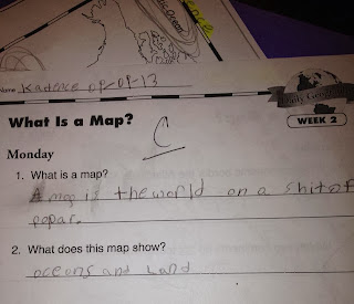
Unfortunately, my niece Kadence's definition of maps is, frequently, correct. Here are some tips to avoid landing squarely within this sentiment.
Alright, you didn't ask for it, and here they are! The final ten unrequested map tips. As with the previous ten, I'll use examples from my stuff because it's easy to ask my permission (and slightly less because of rampant megalomania). Also, to attach credibility, please read the following with the inner-monologue voice of Morgan Freeman...
#11: Thinking choropleth for count data? Maybe try dot
density. It self-normalizes for area, is emotionally resonant, and looks
cooler.
They are speckly little wonders. They dispense with the whole normalize-by-area problem, sure, but they also detour you right past that abstract business of data range classification and tying those ranges to a color key (and the good old legend, map, legend, map workflow as working memory constantly vaporizes).
A single dot representing a single thing is a big fat affordance of interpretation and a smooth on-ramp to an natural cognitive association of your data with volume and dispersion. Plus it's easier to personalize, encouraging emotional uptake.
Sure, while dot density randomly disperses dots inside the polygons, if the polygons are small and numerous enough then the bummer of randomness is marginalized. Also, there are dark tricks for constraining your dots into more realistic areas (no dots in vacant places).
Dot density isn't always the right way to go, but if you want to illustrate general dispersion and volume (especially if you have a couple of categories to highlight) it's worth a go. Some inspiring characters in this space are Kirk Goldsberry, Andy Woodruff, and Brandon Martin-Anderson.

Can I actually count up all the commuters? No, but who cares. I get a good sense of the dispersion of commuters though, plus, bonus, what method they use to commute. Alternatively, this would have required four separate choropleth rate maps to get the same point across, and even then I'd have huge low-population areas gobbling up most of my visual plain. From People Dots: Seattle Area Commuting.

When mapping individual human counts, nothing resonates emotionally quite like a one-to-one dot density approach. From Gender Flow in NY. Those are people, man!
#12: Be intentional about aesthetics. Good design buys a
second, closer, look.
This one's harder to write about because it's more subjective (plus any attempt to elaborate makes me feel like a pretentious know-it-all). But there are definitely good lookin maps and ugly maps. And all things being equal, the good lookin map is going to visit a much broader audience. Maps are portraits of a phenomenon so other humans will look at it and appreciate the message. That's it.
In my experience, the first time that became obvious to me was with the tornado tracks map. This map went mainstream because people thought it was pretty. Then they started noticing things and asking questions. When people stop and look because something is cool, the thing to note is that they stopped and looked. When something you design is visually striking, you stuff it with the currency that buys thoughtful attention.
The greatest step you can take towards honoring the aesthetics of your map is to avoid defaults (#3). Also, I like this discussion at Stack Exchange -lots of variability (and more detail than an unrequested tip).
I feel like a real tool actually citing an example for this, but it was a solid lesson for me in the importance of aesthetics in map design and its capacity to infiltrate a wide audience. Geographic data has potential energy like no other form -appealing design converts that into kinetic energy. From Tornado Tracks.
#13: Sometimes maps are a terrible way of presenting a
geographic phenomenon. Don’t carto so quickly.
Because you are a cartographer, of course you'll be inclined to map geographic data geographically. But some of the inherent properties of geography make the strict spatial representation of a phenomenon an inefficient and ineffective means of presenting it. It's not heresy to present it another way and I hope you never feel bound by spatial in the presentation tier.

I first saw this data rendered as a set of many many maps that you could pick to see one at a time (one world map for every historic Olympic games). Effective comparison between games was tough. Also, the geographic size of countries varies dramatically (and distracted from the message) and many of them I couldn't see or even tell which were which. The data was compact and awesome, but divested into a string of maps wasn't doing it justice.
In one cell chart, the mutual dimensions of countries, eras, and rates, increases findability, and traces the lifelines of whole nations at a glance. Plus it happened to look like a DNA stain, which was serendipitous. P.S. This is a screenshot of Excel. From Olympic Medal Counts In Perspective.
In one cell chart, the mutual dimensions of countries, eras, and rates, increases findability, and traces the lifelines of whole nations at a glance. Plus it happened to look like a DNA stain, which was serendipitous. P.S. This is a screenshot of Excel. From Olympic Medal Counts In Perspective.

While the lion's share of the work was heavy geoprocessing across several spatial data sets, the result above is a distilled set of lists. Just because something is hard to do doesn't mean it should look like it was hard to do. The opposite, really. The relative geographic sizes, shapes, and locations of these cities made their literal mapping impractical and damaging to the message. From Drunk Driving in American Cities.

Sparklines provide a data-dense and intuitive representation of 100 years of the apportionment balancing act for every state. From Visualizing Apportionment.
#14: Using Mercator if you don’t have to, or Equirectangular for...anything? Use something else, anything else!
Another plea to avoid defaults! Equirectangular is the convenient de-facto of GIS data distribution (pretty much what you get if you never consider projection in your process). Once you are looking at that data, Equirectangular's job is done. A hallmark of the bush leagues, it should under no circumstances survive into map production (except maybe if you are tracking satellites, but really, are you tracking satellites?).
Mercator is, admittedly, a fair tradeoff if you are making a web map. Currently there isn't a ton you can do about that. But if you are making a static map from scratch and you aren't leaning on a tiled service for your basemap then why would you use it? Picking a projection that illustrates your phenomenon well, or in a novel perspective, can be the most mind-blowing part of cartography.

While a little disorienting at first (that's fine, there is evidence that struggle promotes memory retention), the polar projection is my favorite part of this map. It reveals the nestedly cyclic nature of hurricanes and invokes a fun fractal-like consideration of the universe. From Hurricanes Since 1851.
{Are you still reading this with the inner-monologue of Morgan Freeman? I was serious about that.}
#15: Don’t box out your legend or supporting charts. They
should be integrated, not quarantined.
I used to be the carto-segregation king. Everything got a box! In time, and with the advice of Amy Lobben, I began dispensing with the neatline and integrating visual elements. There is research that shows a more integrated placement of data-conveyance elements (words, charts, maps, images...) facilitates a faster and firmer understanding of the phenomenon. Also, I've an ally in Tufte in this regard so take it up with him if you want to stick all your illustrations in a crappy appendix!
Daniel Huffman (once more) provides detail and clarity in the plight against neatlines.

Nobody puts Baby in the corner. Integrate map, notes, charts, graphics, legend, whatevz (also, check out how that chart is also a legend! Boom, #4!).
From Data Americana.

Conversely, the understanding that proximity implies a relationship can be leveraged to team elements up for cross-comparison within a single graphic. From Telling the Truth and Mapping the Truth.
#15: Do you need that basemap? Can it be simplified?
Sometimes enough data can provide its own geographic context.
Mostly what I mean is, does your data really need to have that Google Maps background? Google Maps is a great wayfinding and placefinding utility, but not so much for the background of a data map. Often there is much more noise than signal in a consumer-oriented basemap, altering and sometimes damaging the effective presentation of your phenomenon. Try out some alternate (simpler) tile sources if you are making a web map. And if you are making a static map, try pushing back your basemap prominence either a lot or into oblivion.
If your data is dense enough, it may well provide enough context to support itself. A basemap is only there to provide a geographic reference, and should not be an almanac of all things spatial (maybe it doesn't need all those roads, railroads, golf courses, rivers...).

Sometimes even a single data source, like building footprints, is so data-dense that its cookie-cut negative space provides the context for the phenomenon. From Sandy and the Buildings of NYC.

The phenomenon is the focus. Faint major arterial roads and state borders are enough to provide a geographic orientation. From A National Portrait of Drunk Driving.
#16: Show that same mapped data in companion charts. More
visual dimensions for discovery.
Companion charts don't have to be different data. If you can present some quality of that geographic data in one or more other visual constructs, than a fuller picture of the phenomenon is presented. They all begin to support and illuminate eachother. An ecosystem of goodness.

Companion charts don't have to be different data. If you can present some quality of that geographic data in one or more other visual constructs, than a fuller picture of the phenomenon is presented. They all begin to support and illuminate eachother. An ecosystem of goodness.
Showing the exact same data in many dimensions illuminates trends and strengthens the value of each.
From Major Fires Since 2001.
#17 Stuck with stoplight colors? Pick similar hues that are
still cool for the color-deficient. I blow this all the time.
Sometimes the effective cultural conventions of color override what might be a more efficient means of assigning color. Bring on the stoplight metaphor. If you are mapping poor, good, best or slow, medium, and fast, then you will be forsaking an awful lot of reader pre-programming if you don't use good old green yellow and red. But that doesn't mean you have to use the more troublesome flavors of those hues, pushing green one way and red another way makes them far more discernible to the color-deficient.
Red-green vision deficiency is just prevalent enough that you can't ignore it with notions of practicality and just rare enough that the use of troublesome color combinations is still common.
I botch this all the time, but I increasingly take efforts to run graphics through color-deficiency simulators and tweak hues so that the colors are discernible.

Simulators are great empathy resources. You can tweak your hues to be more palatable (wink) to the color-deficient. From Charting for Understanding.
#18: Try de-saturating that satellite background. Like, a
lot.
Always maintain focus of message. Only use a satellite background if that satellite imagery is providing more benefit-through-context than deficit-through-complexity (#15). If your mapped phenomenon sits atop a satellite basmap, mute the saturation of the imagery so it does not fight with or diminish the star of the show. Also it just looks really cool (#12). When I reduce the colors of satellite background imagery I generally push it back to about 20% of its original saturation. Fully black-and-white is alright, but there is a sort of gravitas, and plenty of valuable surface context, when the imagery retains some of its hue.

Always maintain focus of message. Only use a satellite background if that satellite imagery is providing more benefit-through-context than deficit-through-complexity (#15). If your mapped phenomenon sits atop a satellite basmap, mute the saturation of the imagery so it does not fight with or diminish the star of the show. Also it just looks really cool (#12). When I reduce the colors of satellite background imagery I generally push it back to about 20% of its original saturation. Fully black-and-white is alright, but there is a sort of gravitas, and plenty of valuable surface context, when the imagery retains some of its hue.
Desaturated satellite imagery is easier on the eyes, feels more profound, and is a more effective basemap.
From Severe Satellite Basemaps. Source satellite imagery via NASA Visible Earth.
#19: Put unfamiliar units into meaningful context, or
tangible comparisons. Nobody really understands what a Megawatt is.
If you can translate an unfamiliar or intangible unit into something readers can picture or feel, then the map is more relateable and the nature of the phenomenon is more likely to speak to the reader (communication is the only reason there has ever been to make a map). However, if you are mapping electrical field specifications for aerospace specialists and electrical engineers, definitely do not convert technical units into something cute (engineers were bred to reject metaphor and had their cute receptors surgically removed in college).
If you can translate an unfamiliar or intangible unit into something readers can picture or feel, then the map is more relateable and the nature of the phenomenon is more likely to speak to the reader (communication is the only reason there has ever been to make a map). However, if you are mapping electrical field specifications for aerospace specialists and electrical engineers, definitely do not convert technical units into something cute (engineers were bred to reject metaphor and had their cute receptors surgically removed in college).

Not that I totally relate to units of nuclear power plants either, but parsing Megawatts into something remotely tangible provides perspective and clarity of message. From Major Fires Flip-Book.
#20: Did you make a pretty cool map? Pretty AND cool? Put it
on the web and get ready to live! People love maps!
When you suspect you'll be releasing something into the wild, that map will dominate one you know will have no audience. I assure you that sharing your work will sharpen its quality. Also, people eat maps up, and the world needs more excellent examples of them -be ready for all sorts of insights and questions from people who are experts in all sorts of things and people who are simply curious. You may be surprised to learn that there is an eager market for your product and you have little right to keep it to yourself.

Edward Appleby gets it.
You might find, as I have, that making maps and flinging them out into the world is intensely rewarding and to not participate in the adventure of creation when you suspect you've got what it takes is a shame. If making maps or making whatever is something inside you that you just enjoy, chances are you'll get reasonably good at it and that satisfaction will permeate you and those that encounter your work.
If one advances confidently in the direction of his dreams, and endeavors to live the life which he has imagined, he will meet with a success unexpected in common hours.
When you suspect you'll be releasing something into the wild, that map will dominate one you know will have no audience. I assure you that sharing your work will sharpen its quality. Also, people eat maps up, and the world needs more excellent examples of them -be ready for all sorts of insights and questions from people who are experts in all sorts of things and people who are simply curious. You may be surprised to learn that there is an eager market for your product and you have little right to keep it to yourself.
Edward Appleby gets it.
You might find, as I have, that making maps and flinging them out into the world is intensely rewarding and to not participate in the adventure of creation when you suspect you've got what it takes is a shame. If making maps or making whatever is something inside you that you just enjoy, chances are you'll get reasonably good at it and that satisfaction will permeate you and those that encounter your work.
If one advances confidently in the direction of his dreams, and endeavors to live the life which he has imagined, he will meet with a success unexpected in common hours.
No comments:
Post a Comment