
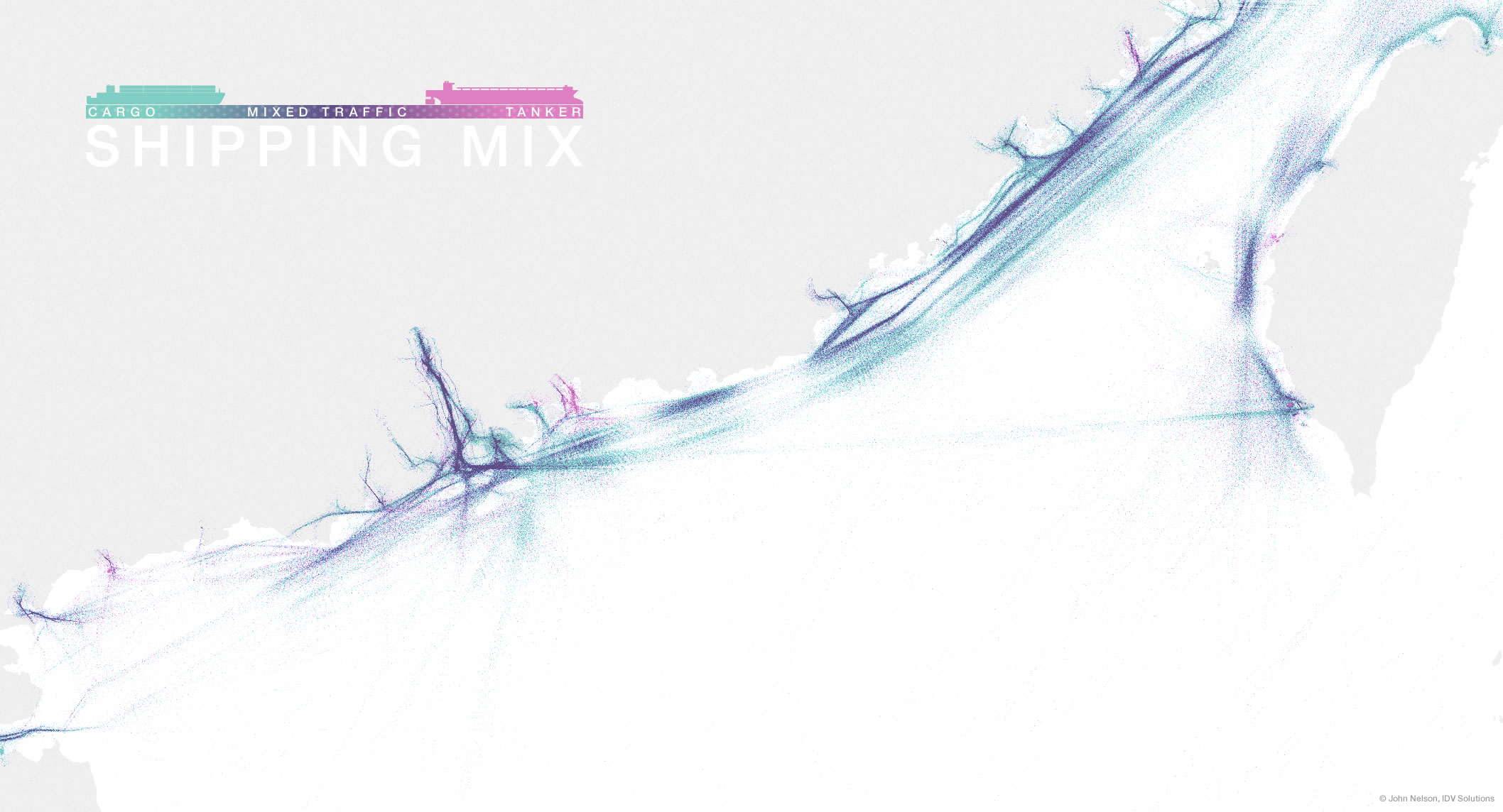
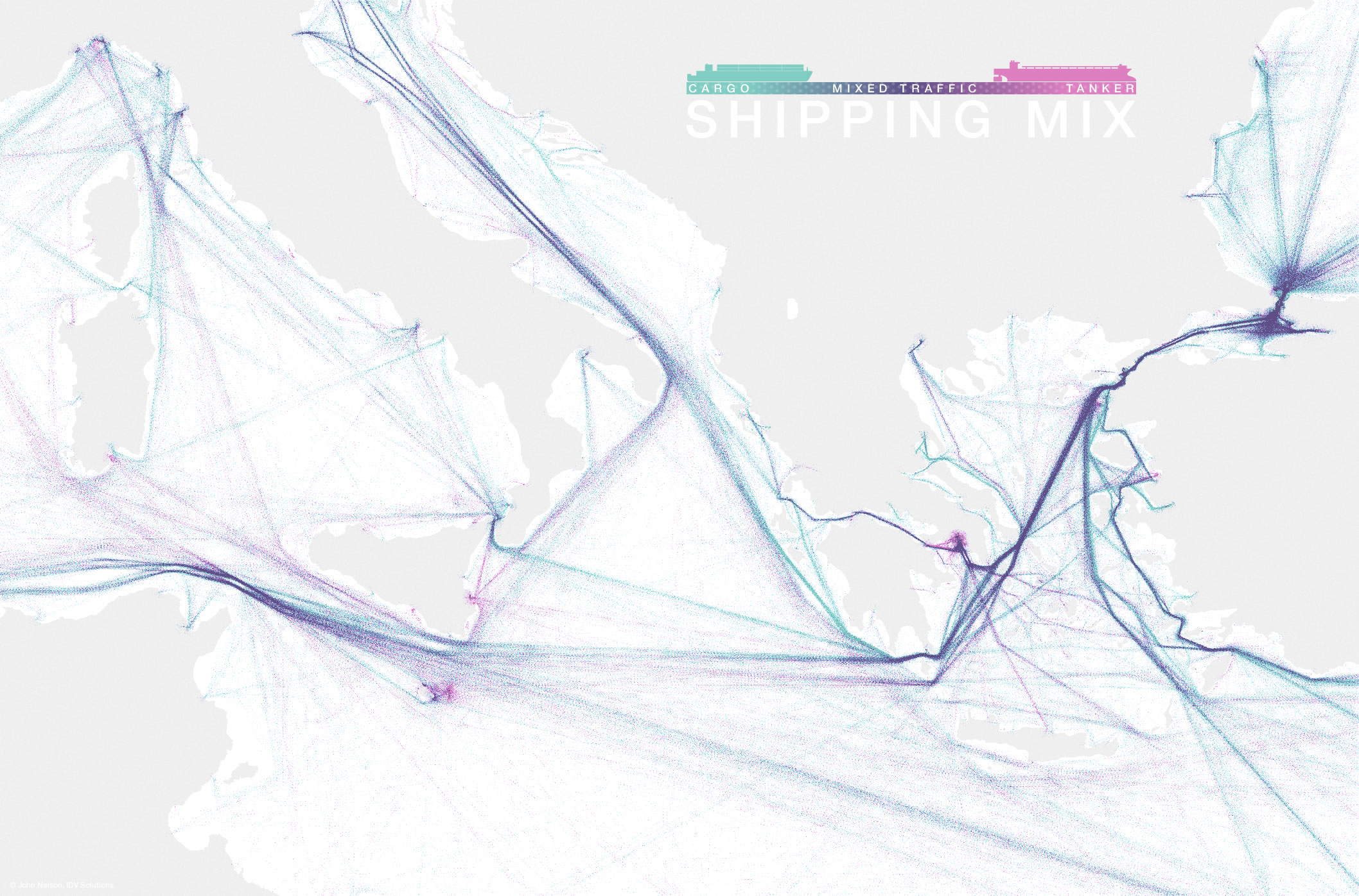
With a fresh pile of one full year's global shipping data, we came back to the flow visualizations that illustrated tangible supply lines that facilitate global trade. This time we've isolated two types of shipping vessels, cargo and tanker, in order to compare their well worn paths, and heatmapped them individually with Visual Fusion. We can generally assume that cargo vessels (the big guys with stacks of shipping containers) are transporting the manufactured goods and materials of international trade, while tankers (enormous floating tubs) carry bulk liquids -almost always petroleum.
So, green means stuff, pink means oil.

Uncategorized (uncolored, too) shipping data heatmapped to show de facto shipping lanes.
Lumped together, though, we don't get a sense for what is being shipped.
Looking at these categorical routes can give us a more nuanced sense of what is flowing where. It's not hard to imagine extrapolating this idea to visualize very specific import/export items, or additional vessel types, or by hazardous content flag. Another idea is to segment this data out by month-of-the-year to get a sense for seasonal fluctuations in global trade flow. That time data could be mapped individually, like we've done here with vessel type, or better yet go full-on stats nerd and in R run them through a hotspot engine to isolate the time-space intersection of shipping spikes. Actually, that would be pretty awesome.
Anyways, here are the results of the comparative cargo/tanker traffic mapping...
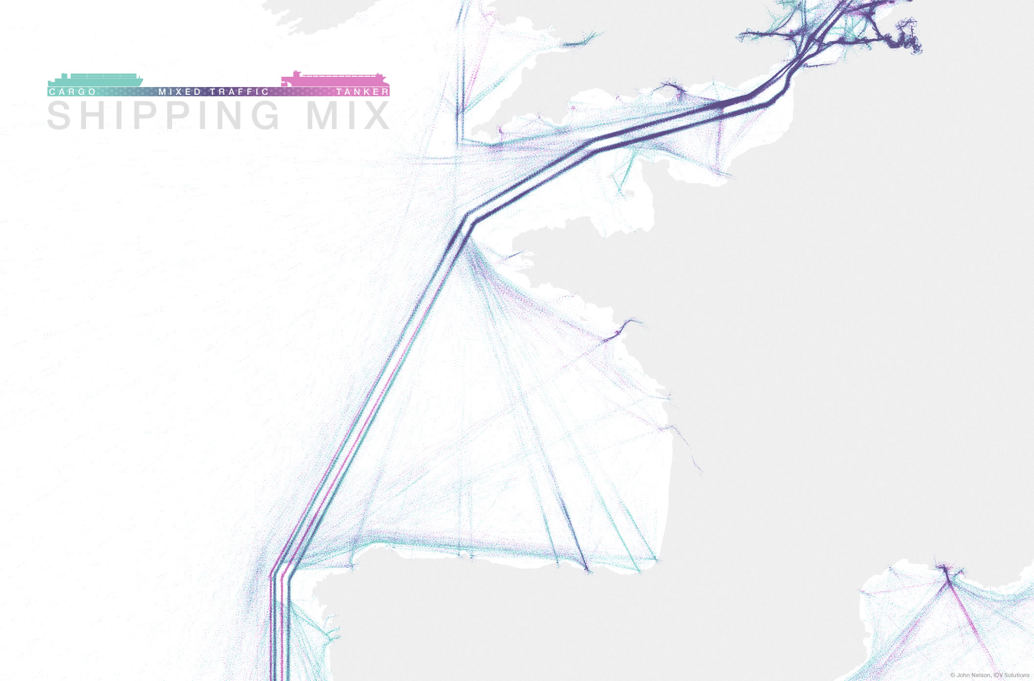
Southwestern Europe

Aegean Sea
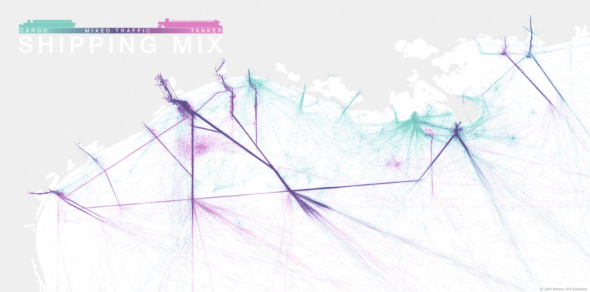
Gulf Coast
Hong Kong
Eastern Mediterranean

Persian Gulf
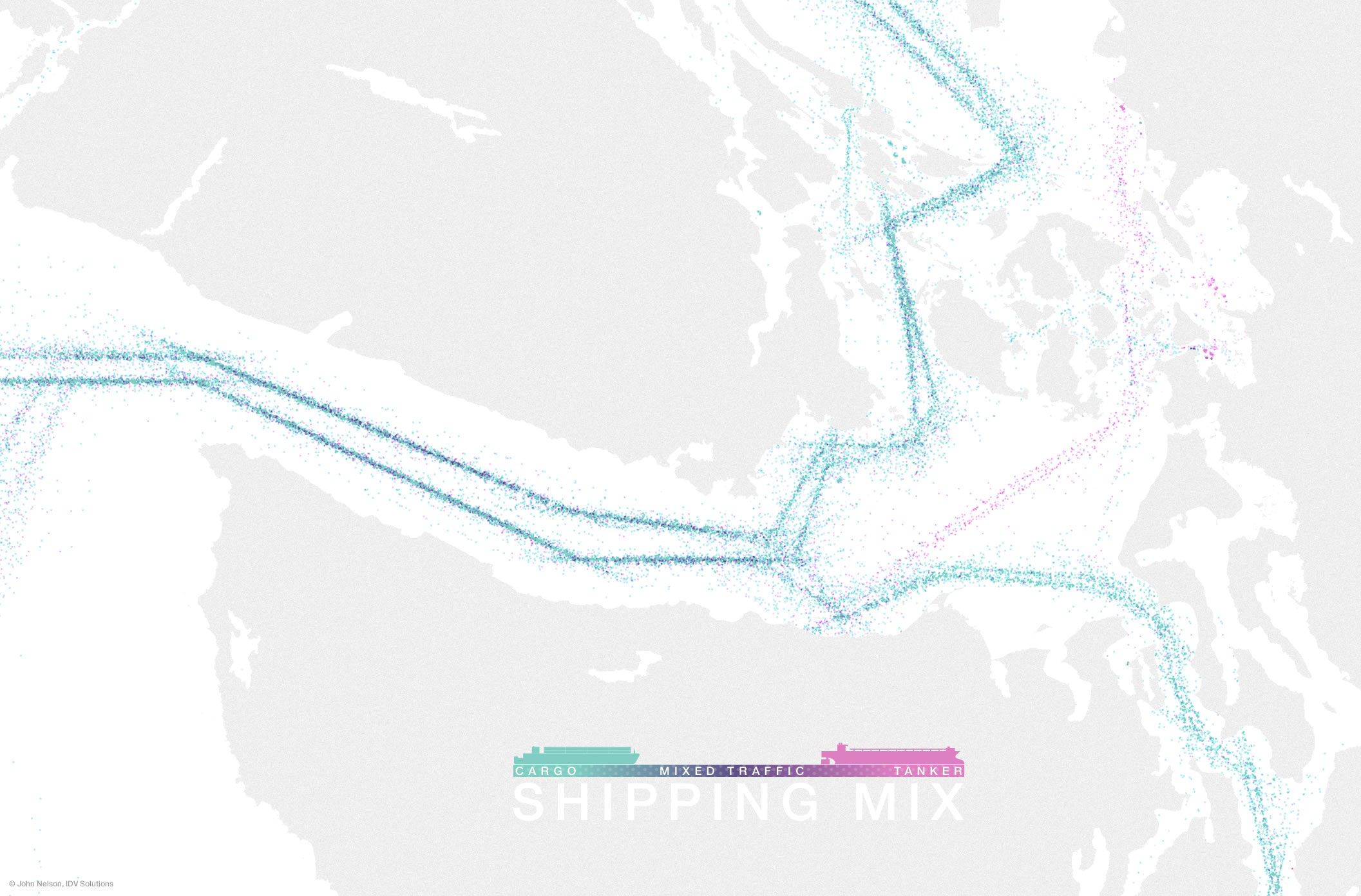
Vancouver/Seattle
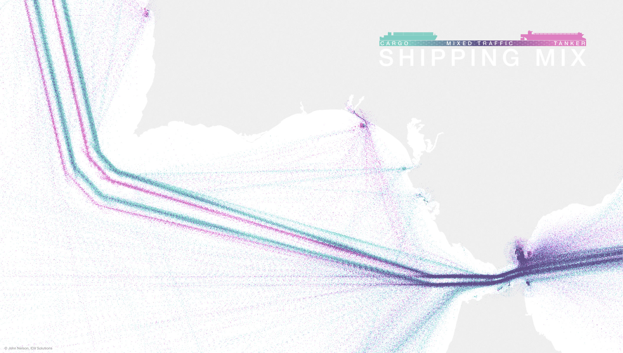
Gibraltar
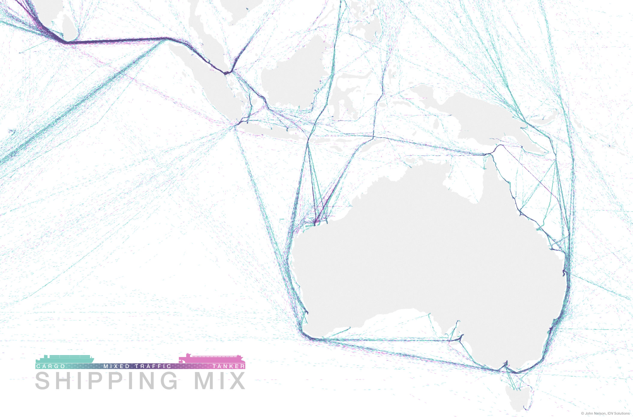
Australia/Singapore
This is really nice,
ReplyDeleteHow did you do it with R?!
This looks amazing. One question: where did you get the data of the shipmovements?
ReplyDeleteLove these!
ReplyDeleteI'm an architecture student, currently doing a project on international shipping. I'm looking to map shipping data in a similar way to this, also looking at maps like these (http://collabo.olihb.com/)
Where did you get your data from? And how on earth did you get it looking so pretty?!
Thanks