

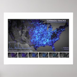
Got this data from NOAA via the spectacular Data.gov. It tracks 56 years of tornado paths along with a host of attribute information. Here, the tracks are categorized by their F-Scale (which isn't the latest and greatest means but good enough for a hack like me), where brighter strokes represent more violent storms.
Animations and Stuff
Check out the interactive version here.
Check this tornado tracks map broken out by F-Scale here.
Check this tornado tracks map broken out by seasonality here.
Check this tornado tracks as a print, available here.
Animated by month or by year.
Here is a more recent breakout of tornadoes by the direction they traveled.
Update
Here is an updated version of the Tornado Tracks map with newer data, including the horrible 2011 season. Thanks to NOAA's http://www.spc.noaa.gov/wcm/ for the historical csv coordinate dataset and Adam Hill for development. Interestingly ('excitedly' if you are a supernerd), while the original was a manual creation, this update is based on a raw export from Visual Fusion. Export your own from the interactive version, here.

Click image for waaay higher resolution options, or click here to make your own map in the interactive version.
Other Sort-Of Related Maps
If this map is interesting to you, you might be amenable to plunging down the rabbit hole of related visualizations...


Nice looking map! I'm surprised that almost all the tracks look linear. Is that really the case for tornado paths or is it because the data only has initial and final sightings?
ReplyDeleteThanks Jeff! I don't see it in the documentation, but it must be the estimated touchdown to liftoff vector.
DeleteGood point Jeff...
DeletePretty large scale map, those tracks are probably miles or tens of miles wide as depicted.
DeleteThe tracks really are pretty linear, and are hundreds of yards to as much as a mile wide.
DeleteWhy does anybody leave here?
DeleteGiven the size of the USA and the scale width of the line ..that's a pretty wide path for a tornado.
DeleteTornadoes move in relatively straight lines because clouds move in generally straight lines and tornadoes come from clouds.
DeleteCoool!!
ReplyDeleteIt's cool...but what is the exact address? I haven't be able to dig it up. More input, please.
ReplyDeleteHi Dan. I got the data from Data.gov doing a "tornado tracks" search. Here's a link: https://explore.data.gov/Geography-and-Environment/Tornado-Tracks-and-Icons-1950-2006/8vq3-ke4t
DeleteThe attributes for each tornado are really interesting and useful and I only wish I'd incorporated more for charted references.
Hi John. Thanks for the link. I'm thinking it might make an interesting poster.
DeleteI'm thanking you again for the link.
DeleteYou must be special. Even with the link, I can't find the graphic image you shared.
I wanted to study to image up close.
Any idea what you searched for; the exact words? Oh well.
Oh, I see, you didn't mean the source data but a larger version of the image. Here you go: http://visually.visually.netdna-cdn.com/TornadoTracks_4fbd458d255c5.jpg
DeleteGreat map. It'd be interesting to see this filled in with 2007-2011 data, especially since the last few years have been so active. The full data set can be found at www.spc.noaa.gov/wcm/ or www.tornadohistoryproject.com.
ReplyDeleteGreat, thanks Jon! I had been looking for this!
DeleteJon,
DeleteThe last few years have not been very active on a historical basis.
I found what those big paths in Florida were. TIL.... http://en.wikipedia.org/wiki/1966_Tampa_tornado_family
ReplyDeleteHi John,
ReplyDeleteGreat looking visualization. Can you tell me about some of the tools used in creating this?
Thanks!
~RB
This is a beautiful map. Were I currently able, I would ask to buy a poster copy, have it framed, and hang it on my wall.
ReplyDeleteIt would be interesting to see this as a animated graphic over tom
ReplyDeleteThe strikingly bright one in Wyoming is http://en.wikipedia.org/wiki/Teton-Yellowstone_tornado the most violent high altitude tornado measured to date. I grew up there, but I had no idea.
ReplyDeleteIn response to the comment about the tornado paths all being linear the tornado lengths are correct. The data file that was used connects a straight line between the lat/long of the starting point to the lat/long of the ending point. Those are historically the only points that were stored for every known tornado. It was not until recent years that the usefulness and practicality of storing an approximate path was discovered. Remote sensing is also used to more accurately locate exact tornado paths in addition to the damage survey information and all of this data is easier to store and manage now using GIS(geographic information systems)than has been in the past.
ReplyDeleteThis map was created using a raw or unprojected shapfile which definitely increases the error in path location, but the error with this data set is already pretty high. The graphic is unique and visually appealing, I love the idea, but the inaccuracies make it difficult for me to enjoy.
John, is there a particular reason that you chose to use a Mercator or unprojected shapefile for this map?
Thanks,
Amber
Thanks for the interest and background, Amber!
DeleteI did project (Mercator) the original data so that it's placement over the basemap was accurate and true to the source. The precision is commensurate with the scale of the map. I wanted a national look with a broad time span to let the data's message (relative frequency, location, and severity) speak for itself, in a presentation that would democratize the information. It's been a fun project and I'm surprised and excited over the response -folks have notices really interesting and insightful aspects of tornado trends that I'd never considered before. For example, lots of readers are now discussing the importance of mountains and land relief in the prevalence (or lack) of tornadoes, which is awesome! Another reader noticed the correlation of length to severity, which I'd never really considered before, which sent me back to the data for more question asking (the goal of a good visual). Here's what I found...
Total deaths, total injuries, avg miles
F0: 7, 267, 2
F1: 111, 3270, 6.58
F2: 363, 10373, 11.4
F3: 958, 18160, 17.80
F4: 1912, 28427, 28.62
F5: 1013, 11038, 38.87
Anyways, I'm so happy for the support and glad folks are interested in the data!
Unfortunately the effect of using Mercator is to increase the apparent length of the tornadoes in the northern regions of the United States in comparison to the southern regions. So another projection would be preferred.
DeleteJohn, Thanks for the great map!
ReplyDeleteJust thought I would let you know that you've been linked on Fark.com, in their geek section, and will be getting some serious pageviews starting around 2:30am.
Oh, and thanks for the new wallpaper!
Thanks for all the fun notes!
DeleteSorry am I missing something here!
ReplyDeleteWould it not be a good idea to see this in a zoom and pan 3 dimensional format. So you could appraise the results more accurately?
If you look very closely at these linear lines many are actually curved.
This would be so cool. IDV Solutions is working on an interactive version so people can zoom around and filter. It will also be a chance to show a lot more of the data NOAA collected around each track. I'll keep you posted on the progress.
Deletewww.idvsolutions.com
Great visualization! What strikes me is that the infamous "Tornado Alley" of Oklahoma and Texas panhandle doesn't jump out at you from this map - rather, the entire Midwest/plains states seem to be equally afflicted by tornados. Surprising, and interesting!
ReplyDeleteAh, Alabama has also been called "Tornado Alley" and this pic confirms that the Tuscaloosa-Birmingham-Gadsden/Anniston corridor plays host to some of the most vicious twirlers. I had the great un-pleasure to be on duty in a local TV station control room that Sunday morning when the "Palm Sunday" tornado literally changed the face of tornado reporting. That whole several year period cost me a lot of my hair!
Deletei do not see the Joplin tornado.. Ive looked several times, I know the path and i dont see it.. Anybody else or is it just me?
ReplyDeleteLOL this is really bothering me, I dont see it.. Haha.
DeleteThis is an awesome map though. Sorry, I'm not at all complaining. Im just trying to find that tornado lol
This data set is from 1950 to 2006 so the Joplin tornado would not be included.
DeleteWell now that would just make too much sense..
DeleteIs there any way to break this data down into the various Fujita scales over the same period? i.e....the f-0 for the same period....f-1, etc.
ReplyDeleteI'd love to see how the more serious storms appear over time.
here is an image of that:
Deletehttp://uxblog.idvsolutions.com/2012/06/tornado-tracks-by-f-scale-small.html
Did you see that weather.com is showing off your lovely map?
ReplyDeletehttp://www.weather.com/weather/videos/news-41/top-stories-169/one-map-56-years-of-american-tornadoes-28915
Nice work!
I love this map and the rest of the work you have done.
ReplyDeleteWhere did you find the dark basemap? Is that something you had to create yourself?
Great looking map! I'm really intrigued by the gap over West Virginia. Does anyone have an explanation for that? Is it lack of reporting or a weather effect?
ReplyDeleteWell one incorrect assumption is that the tornadoes paths appear linear.
ReplyDeleteThe Earth is curved not flat.
For some strange reason seemingly intelligent people forget that one fact when looking at the earths surface in a 2d perspective.
Well, that may be true, but the real issue is fact that storm track data that is published by NOAA, NWS and NSPC only contains a beginning and ending point to describe the entire path! It might be more accurate to draw a rhumbline between the two points instead of a straighth line in 2D, but without more points to describe the actual path, the rhumbline would still only be a "best guess"!
DeleteI take your point. But I think you mean Great Circle Route (which is the true straight line between two geographic points). A rhumbline is a navigational convenience so that an angle of travel can always intersect lines of longitude at the same angle, making navigation by compass easier, though it isn't necessarily the true "straight" line path.
DeleteCoincidentally, rhumblines appear straight in the Mercator projection, (which is used in this map for better or worse) so the tracks you see in this map are actually rhumblines. It's why the Mercator projection was so popular for 15th century navigators ("we'll take the winding way home but at least we can plot it on a map").
Were I more intelligent, according to "OneoldDude" I'd have used great circle paths. But I'm not and I didn't. But maybe next time!
Cool! Has anyone ever done maps of floods, blizzards and wildfires? It would be a great way to find a relatively safe place from natural disasters to live.
ReplyDeleteHi guys, love the map I did a 3D version in Google Earth > http://twistedskies.net/blog/?attachment_id=478
ReplyDeleteLet me know what you think!
This is a very impressive visual representation Mr. Nelson. I hope you can look past the ridiculous comments above. I often wonder what the world would be like if classic artists lived in the internet age. TV stations across the country and weather.com are picking it up. I think that speaks to what you've put together. Very nice.
ReplyDeleteAgreed. Kudos!
DeleteI'd like to ask the same question as lakes451. Why the gap in the NE? It stands out a mile!
ReplyDeleteThe reason that there is a gap over West Virginia and other parts of the North East is that the air masses required to produce the supercell thunderstorms that produce tornadoes, the collision of the Continental Polar and Maritime Tropical air masses, are not present in this region of the country. It is not impossible for a weaker tornado to form in this region, nor do the mountains somehow protect this region from tornadoes, they are just not as common of an even here as they are in the great plains and the deep south. Most of the tornadoes that form in this region are weaker and have shorter paths, this is in part because of the many factors effecting tornado genesis are not present or are much weaker in the region (instability of rising air, mid level wind sheer, and many other factors too complicated to explain) also many of the tornadoes in this region are produced from storms once associated with a hurricane or tropical storm. I hope this answers your questions.
ReplyDeleteDon’t count on life to see you through; count on yourself to see you through life.
ReplyDeleteFlights to Entebbe | Cheap Flights to Entebbe | Cheap Air Tickets to Entebbe